

Wind energy generation 2/2 - exploratory data analysis
banner made from an image of Narcisa Aciko on pexels.com
Introduction
This dataset contains hourly estimates of an area’s energy potential for 1986-2015 as a percentage of a power plant’s maximum output.
In the previous part, we’ve made clusters of countries with similar profiles of wind generation. In this 2nd part we’re going to analyse and explore datas for one country representative of each cluster. As a reminder, here are what those 6 clusters made of :
Countries grouped by cluster
cluster nb : 0 EE FI LT LV PL SE
cluster nb : 1 ES PT
cluster nb : 2 AT CH CZ HR HU IT SI SK
cluster nb : 3 BE DE DK FR IE LU NL UK
cluster nb : 4 CY NO
cluster nb : 5 BG EL RO
import numpy as np
import pandas as pd
from scipy import stats
import seaborn as sns
import matplotlib.pyplot as plt

pd.options.display.max_columns = 300

import warnings
warnings.filterwarnings("ignore")

path = "../../../datasets/_classified/kaggle/"


countries_lst = ['FI', 'PT', 'IT', 'FR', 'NO', 'RO']
df_wind_on = pd.read_csv(path + "EMHIRES_WIND_COUNTRY_June2019.csv")
df_wind_on = df_wind_on[countries_lst]
df_wind_on.head(2)
| FI | PT | IT | FR | NO | RO | |
|---|---|---|---|---|---|---|
| 0 | 0,31303 | 0,22683 | 0,33069 | 0,17573 | 0,26292 | 0,05124 |
| 1 | 0,33866 | 0,25821 | 0,30066 | 0,16771 | 0,26376 | 0,04665 |
Dealing with timestamps
def add_time(_df):
    "Returns a DF with two new cols : the time and hour of the day"
    t = pd.date_range(start='1/1/1986', periods=_df.shape[0], freq = 'H')
    t = pd.DataFrame(t)
    _df = pd.concat([_df, t], axis=1)
    _df.rename(columns={ _df.columns[-1]: "time" }, inplace = True)
    _df['hour'] = _df['time'].dt.hour
    _df['month'] = _df['time'].dt.month
    _df['week'] = _df['time'].dt.week
    return _df


for c in df_wind_on.columns:
    df_wind_on[c] = df_wind_on[c].str.replace(',', '.').astype('float64')

df_wind_on = add_time(df_wind_on)
df_wind_on.tail(2)
| FI | PT | IT | FR | NO | RO | time | hour | month | week | |
|---|---|---|---|---|---|---|---|---|---|---|
| 262966 | 0.47398 | 0.08945 | 0.00625 | 0.21519 | 0.54109 | 0.11247 | 2015-12-31 22:00:00 | 22 | 12 | 53 |
| 262967 | 0.47473 | 0.10206 | 0.00859 | 0.17319 | 0.54552 | 0.12690 | 2015-12-31 23:00:00 | 23 | 12 | 53 |
df_wind_on.dtypes
FI              float64
PT              float64
IT              float64
FR              float64
NO              float64
RO              float64
time     datetime64[ns]
hour              int64
month             int64
week              int64
dtype: object
Data Analysis
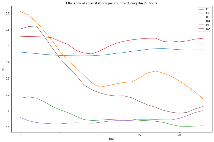
First, let’s take a look at the last 24 hours, the least we can say is that there isn’t any similarities or pattern in the graph below :
def plot_hourly(df, title):
    plt.figure(figsize=(14, 9))
    for c in df.columns:
        if c != 'hour':
            sns.lineplot(x="hour", y=c, data=df, label=c)
            #plt.legend(c)
    plt.title(title)
    plt.show()

plot_hourly(df_wind_on[df_wind_on.columns.difference(['time', 'month', 'week'])][-24:], "Efficiency of solar stations per country during the 24 hours")
Then let’s compare the efficiency of onshore wind stations for each profile during hours of a typical day (based on the data of the last 30 years)
plot_hourly(df_wind_on[df_wind_on.columns.difference(['time', 'month', 'week'])], "Efficiency of onshore wind stations per country during hours of a typical day")
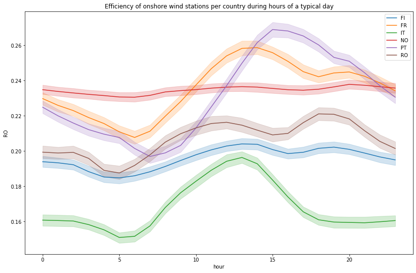
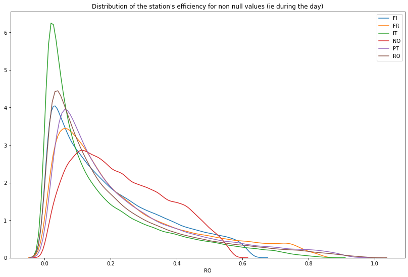
When we look at the distribution of the station’s efficiencies, there isn’t many hours in a day the installation produces actually energy
temp_df = df_wind_on[df_wind_on.columns.difference(['time', 'hour', 'month', 'week'])]
plt.figure(figsize=(14, 9))
for col in temp_df.columns:
    sns.distplot(temp_df[temp_df[col] != 0][col], label=col, hist=False)
plt.title("Distribution of the station's efficiency for non null values (ie during the day)")
Text(0.5, 1.0, "Distribution of the station's efficiency for non null values (ie during the day)")
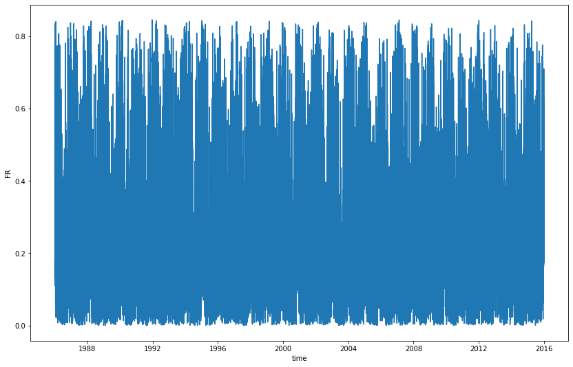
Anyway there are many short spikes each year
plt.figure(figsize=(14, 9))
sns.lineplot(x = df_wind_on.time, y = df_wind_on['FR'])
<matplotlib.axes._subplots.AxesSubplot at 0x7fd833bdd350>
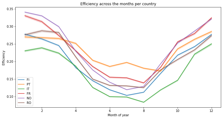
A more interesting insight can be obtained when the efficiency is plotted across the months. It seems that at the opposite of the solar energy generation, the wind produces more in winter
plt.figure(figsize=(12, 6))
for c in countries_lst:
    temp_df = df_wind_on[[c, 'month']]
    sns.lineplot(x=temp_df["month"], y=temp_df[c], label=c)
plt.xlabel("Month of year")
plt.ylabel("Efficiency")
plt.title("Efficiency across the months per country")
Text(0.5, 1.0, 'Efficiency across the months per country')
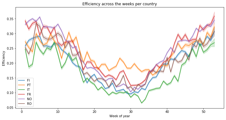
There are more variations at the week level, but the same conclusion can be made :
plt.figure(figsize=(12, 6))
for c in countries_lst:
    temp_df = df_wind_on[[c, 'week']]
    sns.lineplot(x=temp_df["week"], y=temp_df[c], label=c)
plt.xlabel("Week of year")
plt.ylabel("Efficiency")
plt.title("Efficiency across the weeks per country")
Text(0.5, 1.0, 'Efficiency across the weeks per country')
temp_df = df_wind_on.copy()
temp_df['year'] = temp_df['time'].dt.year
temp_df.head()
| FI | PT | IT | FR | NO | RO | time | hour | month | week | year | |
|---|---|---|---|---|---|---|---|---|---|---|---|
| 0 | 0.31303 | 0.22683 | 0.33069 | 0.17573 | 0.26292 | 0.05124 | 1986-01-01 00:00:00 | 0 | 1 | 1 | 1986 |
| 1 | 0.33866 | 0.25821 | 0.30066 | 0.16771 | 0.26376 | 0.04665 | 1986-01-01 01:00:00 | 1 | 1 | 1 | 1986 |
| 2 | 0.36834 | 0.27921 | 0.27052 | 0.15877 | 0.26695 | 0.04543 | 1986-01-01 02:00:00 | 2 | 1 | 1 | 1986 |
| 3 | 0.39019 | 0.33106 | 0.24614 | 0.14818 | 0.27101 | 0.04455 | 1986-01-01 03:00:00 | 3 | 1 | 1 | 1986 |
| 4 | 0.40209 | 0.38668 | 0.21655 | 0.13631 | 0.28097 | 0.05438 | 1986-01-01 04:00:00 | 4 | 1 | 1 | 1986 |
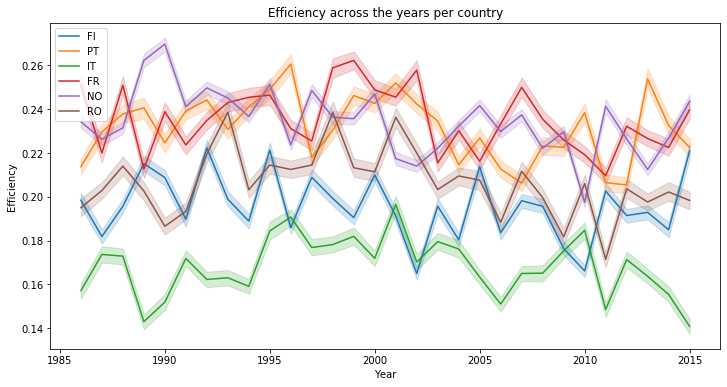
When we compare the energy production yearly, the average performance is rather poor and can change a lot one year to an other :
plt.figure(figsize=(12, 6))
for c in countries_lst:
    temp_df_ = temp_df[[c, 'year']]
    sns.lineplot(x=temp_df_["year"], y=temp_df_[c], label=c)
plt.xlabel("Year")
plt.ylabel("Efficiency")
plt.title("Efficiency across the years per country")
Text(0.5, 1.0, 'Efficiency across the years per country')
temp_df = temp_df.drop(columns=['time', 'hour', 'month', 'week', 'year'])
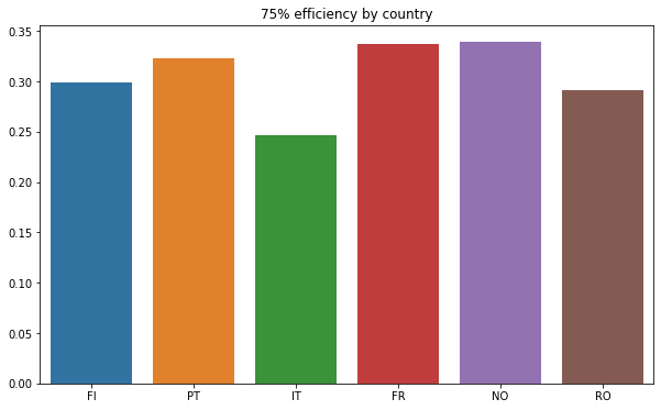
temp_df.describe()
| FI | PT | IT | FR | NO | RO | |
|---|---|---|---|---|---|---|
| count | 262968.000000 | 262968.000000 | 262968.000000 | 262968.000000 | 262968.000000 | 262968.000000 |
| mean | 0.195797 | 0.231411 | 0.168171 | 0.235092 | 0.234455 | 0.206581 |
| std | 0.158490 | 0.200070 | 0.174528 | 0.197681 | 0.138302 | 0.199103 |
| min | 0.000000 | 0.000070 | 0.000040 | 0.000070 | 0.000260 | 0.000000 |
| 25% | 0.062760 | 0.080390 | 0.036400 | 0.082140 | 0.119130 | 0.058230 |
| 50% | 0.153390 | 0.164075 | 0.101570 | 0.170620 | 0.214960 | 0.136680 |
| 75% | 0.298873 | 0.323300 | 0.246170 | 0.337360 | 0.339190 | 0.291813 |
| max | 0.634540 | 0.959080 | 0.870380 | 0.845160 | 0.579430 | 0.992050 |
This is confirmed by the bar plot below :
def plot_by_country(_df, title, nb_col):
    _df = _df.describe().iloc[nb_col, :]
    plt.figure(figsize=(10, 6))
    sns.barplot(x=_df.index, y=_df.values)
    plt.title(title)

#plot_by_country("Mean efficiency by country", 1)

plot_by_country(temp_df, "75% efficiency by country", 6)
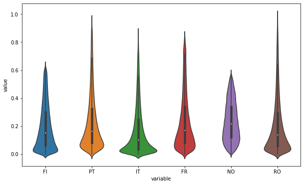
An other interesting way is to use violin plots :
# credits : https://stackoverflow.com/questions/49554139/boxplot-of-multiple-columns-of-a-pandas-dataframe-on-the-same-figure-seaborn
# This works because pd.melt converts a wide-form dataframe
plt.figure(figsize=(10, 6))
sns.violinplot(x="variable", y="value", data=pd.melt(temp_df))
<matplotlib.axes._subplots.AxesSubplot at 0x7fd840723890>
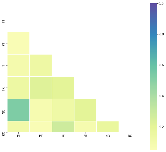
## Correlations
Further more there is no real correlations we could find :
def plot_corr(df_):
    corr = df_.corr()
    corr

    # Generate a mask for the upper triangle
    mask = np.zeros_like(corr, dtype=np.bool)
    mask[np.triu_indices_from(mask)] = True

    # Set up the matplotlib figure
    f, ax = plt.subplots(figsize=(10, 18))

    # Generate a custom diverging colormap
    #cmap = sns.diverging_palette(220, 10, as_cmap=True)

    # Draw the heatmap with the mask and correct aspect ratio
    sns.heatmap(corr, mask=mask, center=0, square=True, cmap='Spectral', linewidths=.5, cbar_kws={"shrink": .5}) #annot=True

plot_corr(temp_df)
temp_df.corr()
| FI | PT | IT | FR | NO | RO | |
|---|---|---|---|---|---|---|
| FI | 1.000000 | 0.055113 | 0.087366 | 0.147905 | 0.530650 | 0.120007 |
| PT | 0.055113 | 1.000000 | 0.139590 | 0.222474 | 0.077719 | 0.050059 |
| IT | 0.087366 | 0.139590 | 1.000000 | 0.209693 | 0.134060 | 0.286878 |
| FR | 0.147905 | 0.222474 | 0.209693 | 1.000000 | 0.208549 | 0.085928 |
| NO | 0.530650 | 0.077719 | 0.134060 | 0.208549 | 1.000000 | 0.168180 |
| RO | 0.120007 | 0.050059 | 0.286878 | 0.085928 | 0.168180 | 1.000000 |
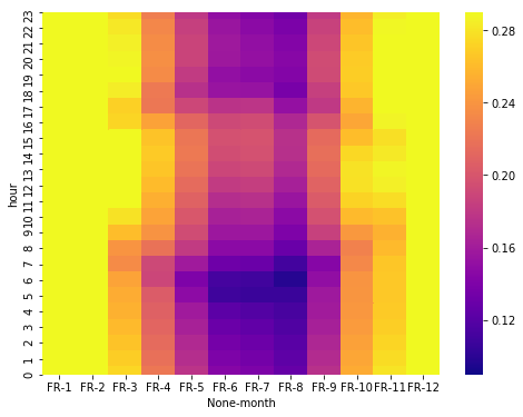
Heatmap month vs hours
Using the same heatmap used for the solar energy generation but for wind, we can guess that the efficiency differences are significant at the month level not at the hour…
# credits S Godinho @ https://www.kaggle.com/sgodinho/wind-energy-potential-prediction

df_wind_on['year'] = df_wind_on['time'].dt.year
plt.figure(figsize=(8, 6))
temp_df = df_wind_on[['FR', 'month', 'hour']]
temp_df = temp_df.groupby(['hour', 'month']).mean()
temp_df = temp_df.unstack('month').sort_index(ascending=False)
sns.heatmap(temp_df, vmin = 0.09, vmax = 0.29, cmap = 'plasma')
<matplotlib.axes._subplots.AxesSubplot at 0x7fd83ac16a90>
Conclusion
In this second part, we’ve explored the data set but we haven’t found real pattern in order to assess the impact of meteorological and climate variability on the generation of wind power. Only the variation during the months of the year is significant. Being able to predict the efficiency of wind energy generation is a really complex issue. It could have been interesting to study it at the region / geographic level but i lack the time to achieve it :)