
Plotly Express in a nutshell
Banner image taken from a photo by Lukas on Pexels.
This post is an aggregation of all the tips from Datacamp and Plotly’s online documentation. I personnally find Plotly really convenient for data analysis because you can obtain great visualizations in few seconds with little lines of code. Moreover these visualizations are interactive and can easily be integrated in web dashboards (who said Streamlit, Dash, Gradio or Taipy? :) )
You can find an Anki deck with the following snippets / plots each in a dedicated flashcard in order to memorize all this stuff here, in my Github repository
Introduction
What is plotly express?
- a high-level data visualization package
- it allows you to create interactive plots with very little code.
- built on top of Plotly Graph Objects (go provides a lower-level interface for developing custom viz).
This cheat sheet covers all you need to know to get started with plotly in Python.
Basics
import plotly express
import plotly.express as px
interactive controls
Functions:
- Basics: scatter, line, area, bar, funnel, timeline
- Part-of-Whole: pie, sunburst, treemap, icicle, funnel_area
- 1D Distributions: histogram, box, violin, strip, ecdf
- 2D Distributions: density_heatmap, density_contour
- Matrix or Image Input: imshow
- 3-Dimensional: scatter_3d, line_3d
- Multidimensional: scatter_matrix, parallel_coordinates, parallel_categories
- Tile Maps: scatter_mapbox, line_mapbox, choropleth_mapbox, density_mapbox
- Outline Maps: scatter_geo, line_geo, choropleth
- Polar Charts: scatter_polar, line_polar, bar_polar
- Ternary Charts: scatter_ternary, line_ternary
Code pattern
px.plotting_fn(
    dataframe,                  # pd.DataFrame
    x=["column-for-x-axis"],    # str or a list of str
    y=["columns-for-y-axis"],   # str or a list of str
    title="Overall plot title", # str
    xaxis_title="X-axis title", # str
    yaxis_title="Y-axis title", # str
    width=width_in_pixels,      # int
    height=height_in_pixels     # int
)
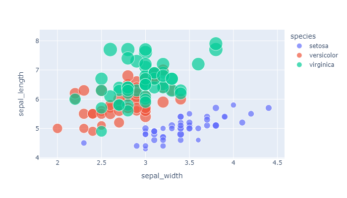
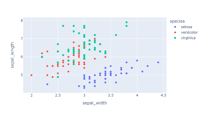
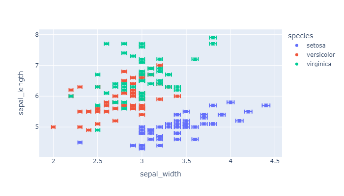
Scatter plot
color can be discrete/categorical
df = px.data.iris()

px.scatter(
    df,
    x="sepal_width",
    y="sepal_length",
    color="species",
    size='petal_length',
    hover_data=['petal_width'],
    width=500,
    height=350
).show()
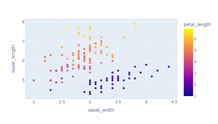
color can also be continuous
px.scatter(
    px.data.iris(),
    x="sepal_width",
    y="sepal_length",
    color='petal_length',
    width=500,
    height=350
).show()
a scatter plot with symbols that map to a column
px.scatter(
    px.data.iris(),
    x="sepal_width",
    y="sepal_length",
    color="species",
    symbol="species",
    width=500,
    height=350
).show()
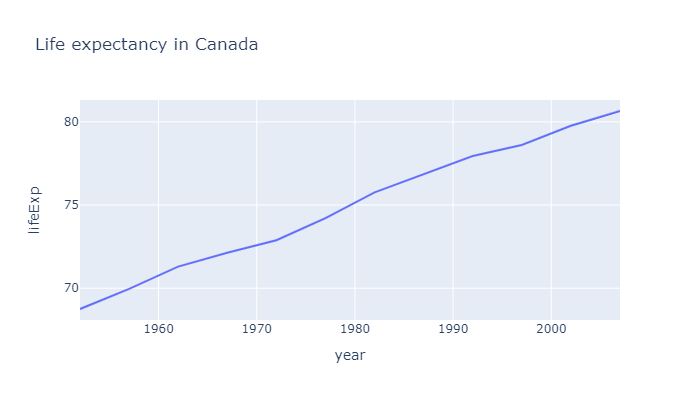
Line Plot
df = px.data.gapminder().query("country=='Canada'")

px.line(
    df,
    x="year",
    y="lifeExp",
    title='Life expectancy in Canada',
    width=500,
    height=350
).show()
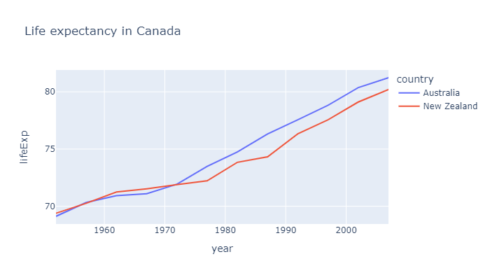
Line Plot with column encoding color
df = px.data.gapminder() \
    .query("continent=='Oceania'")

px.line(
    df,
    x="year",
    y="lifeExp",
    title='Life expectancy in Canada',
    color='country',
    width=500,
    height=350
).show()
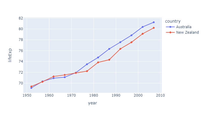
Line chart with markers
df = px.data.gapminder().query("continent == 'Oceania'")

px.line(
    df,
    x='year',
    y='lifeExp',
    color='country',
    markers=True,
    symbol="country", # optional
    width=500,
    height=350
).show()
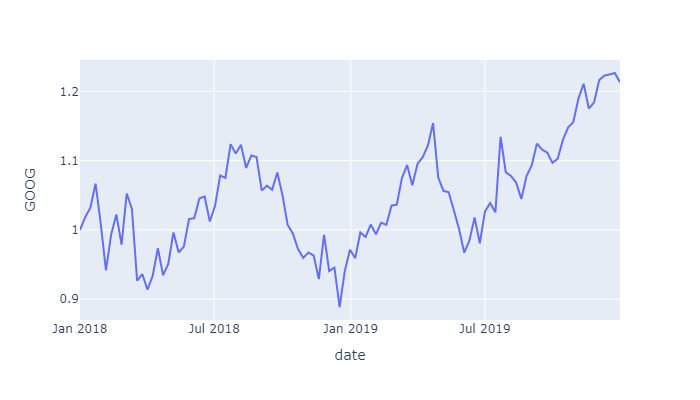
Line plot on Date axes
px.line(
    px.data.stocks(),
    x='date',
    y="GOOG",
    width=500,
    height=350
).show()
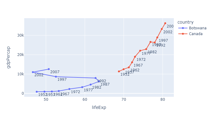
Connected Scatterplots
df = px.data.gapminder() \
    .query("country in ['Canada', 'Botswana']")

fig = px.line(
    df,
    x="lifeExp",
    y="gdpPercap",
    color="country",
    text="year",
    width=500,
    height=350
)

fig.update_traces(textposition="bottom right")
fig.show()
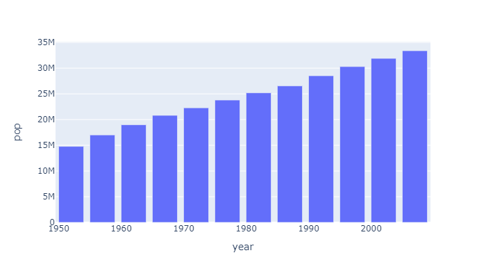
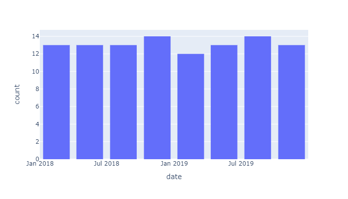
Bar chart / plot
by default vertical
df = px.data.gapminder().query("country == 'Canada'")

px.bar(
    df,
    x='year',
    y='pop',
    width=500,
    height=350
).show()
Bar chart with Long Format Data
long_df = px.data.medals_long()
display(long_df)

px.bar(
    long_df,
    x="nation",
    y="count",
    color="medal",
    title="Long-Form Input",
    width=500,
    height=350
).show()

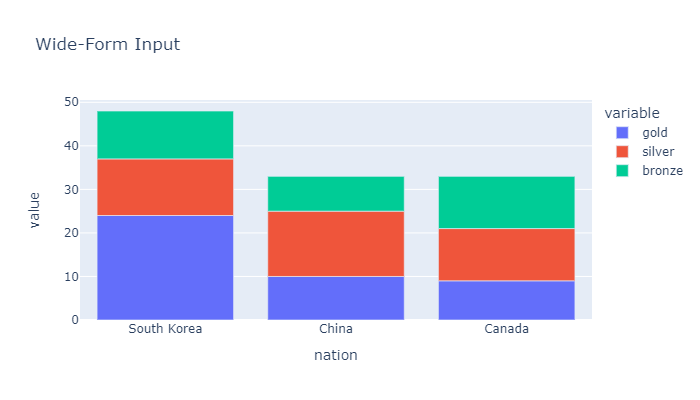
Bar chart with Wide Format Data
wide_df = px.data.medals_wide()
display(wide_df)

px.bar(
    wide_df,
    x="nation",
    y=["gold", "silver", "bronze"],
    title="Wide-Form Input",
    width=500,
    height=350
).show()
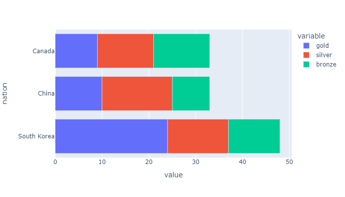
Swap the x and y arguments to draw horizontal bars.
wide_df = px.data.medals_wide()
display(wide_df)

px.bar(
    wide_df,
    y="nation",
    x=["gold", "silver", "bronze"],
    width=500,
    height=350
).show()
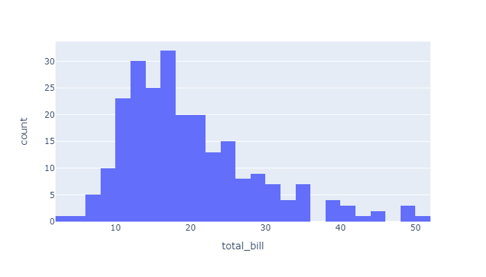
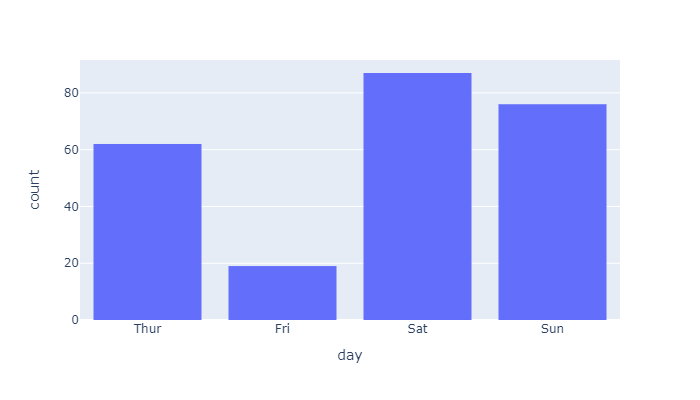
Histogram
px.histogram(
    px.data.tips(),
    x="total_bill",
    width=500,
    height=350
).show()
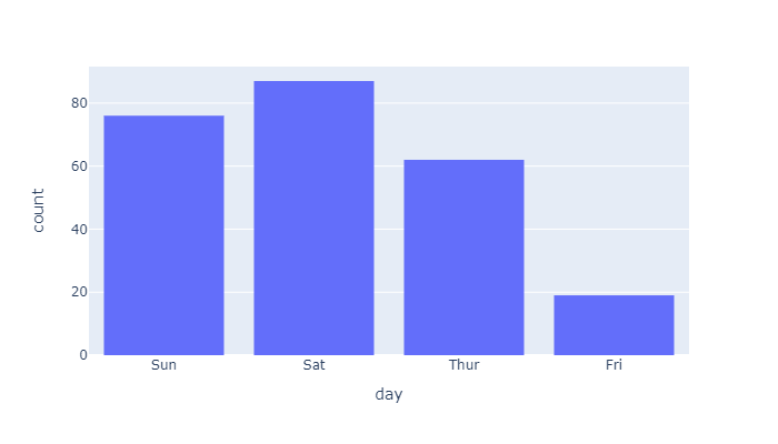
Histogram that use a column with categorical data
px.histogram(
    px.data.tips(),
    x="day",
    width=500,
    height=350
).show()
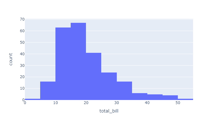
Histogram & choosing the number of bins
px.histogram(
    px.data.tips(),
    x="total_bill",
    nbins=20,
    width=500,
    height=350
).show()
Histogram on Date Data
fig = px.histogram(
    px.data.stocks(),
    x="date",
    width=500,
    height=350
)
fig.update_layout(bargap=0.2)
fig.show()
Histogram on Categorical Data
px.histogram(
    px.data.tips(),
    x="day",
    category_orders=dict(day=["Thur", "Fri", "Sat", "Sun"]),
    width=500,
    height=350
).show()
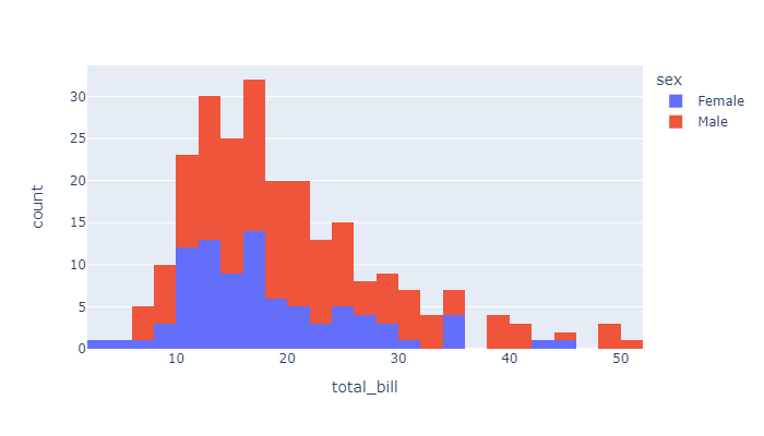
Several histogram for the different values of one column
px.histogram(
    px.data.tips(),
    x="total_bill",
    color="sex",
    width=500,
    height=350
).show()
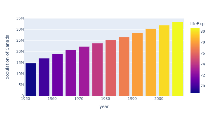
Colored Bar
px.bar(
    px.data.gapminder().query("country == 'Canada'"),
    x='year',
    y='pop',
    hover_data=['lifeExp', 'gdpPercap'],
    color='lifeExp',
    labels={'pop':'population of Canada'},
    width=500,
    height=350
).show()
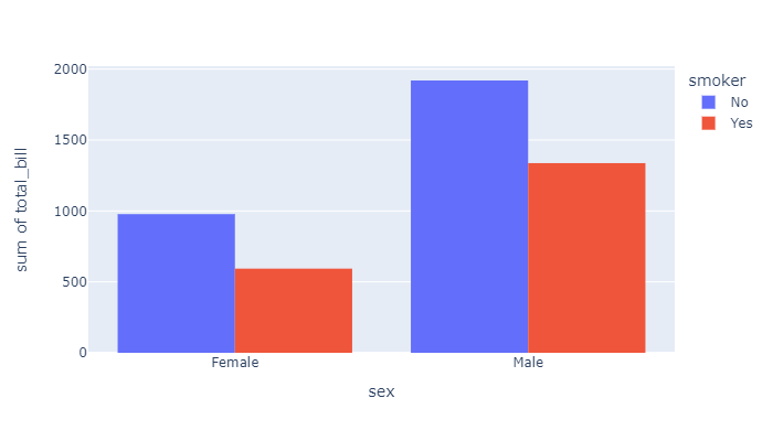
Grouped Bar / Histogram
px.histogram(
    px.data.tips(),
    x="sex",
    y="total_bill",
    color='smoker',
    barmode='group',
    width=500,
    height=350
).show()
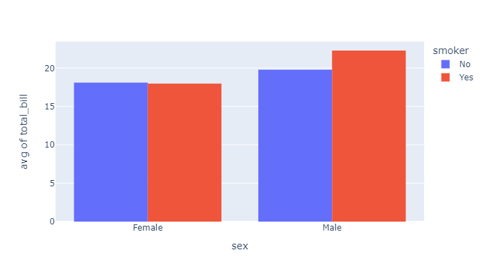
Grouped Bar with Avg
px.histogram(
    px.data.tips(),
    x="sex",
    y="total_bill",
    color='smoker',
    barmode='group',
    histfunc='avg',
    width=500,
    height=350
).show()
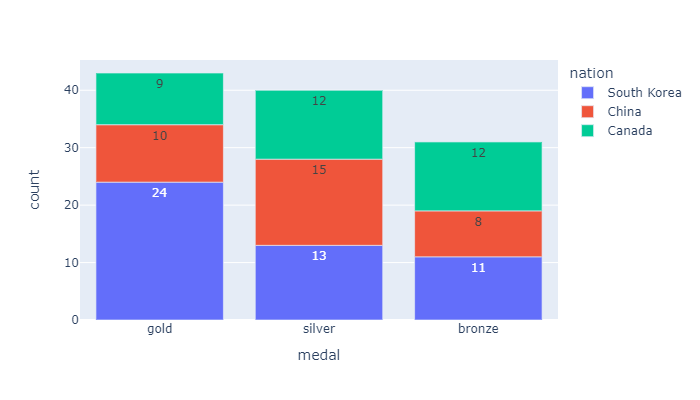
Bar Chart with Text
px.bar(
    px.data.medals_long(),
    x="medal",
    y="count",
    color="nation",
    text_auto=True,
    width=500,
    height=350
).show()
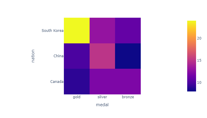
Heatmap
df = px.data.medals_wide(indexed=True)
display(df)

px.imshow(
    df,
    width=500,
    height=350
).show()
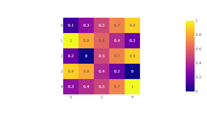
Displaying Text on Heatmap
z = [[.1, .3, .5, .7, .9],
     [1, .8, .6, .4, .2],
     [.2, 0, .5, .7, .9],
     [.9, .8, .4, .2, 0],
     [.3, .4, .5, .7, 1]]

px.imshow(
    z,
    text_auto=True,
    width=500,
    height=350
).show()
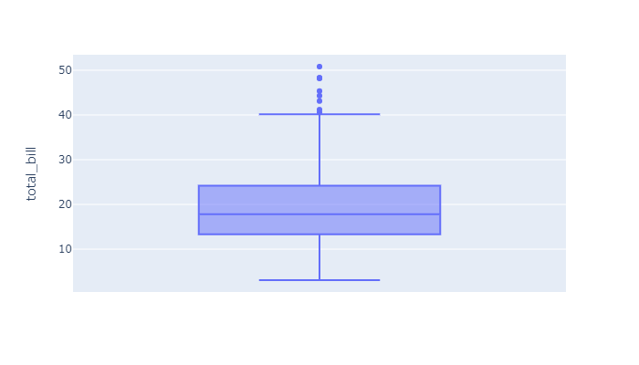
Box Plot
px.box(
    px.data.tips(),
    y="total_bill",
    width=500,
    height=350
).show()
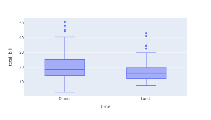
px.box(
    px.data.tips(),
    x="time",
    y="total_bill",
    width=500,
    height=350
).show()
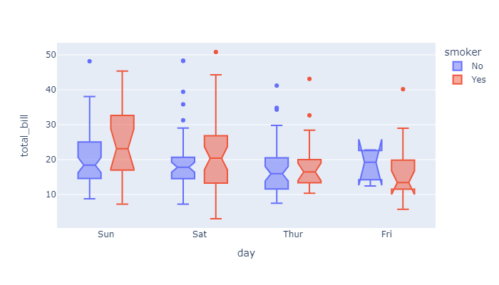
Grouped box plot
px.box(
    px.data.tips(),
    x="day",
    y="total_bill",
    color="smoker",
    notched=True,
    width=500,
    height=350
).show()
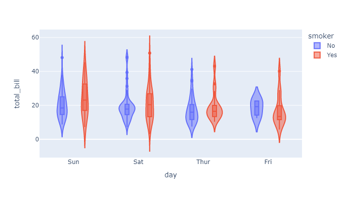
Violin plot
px.violin(
    px.data.tips(),
    x="day",
    y="total_bill",
    color="smoker",
    box=True,
    width=500,
    height=350
).show()
Adavanced
Error bars
df = px.data.iris()
df["e"] = df["sepal_width"]/100

px.scatter(
    df,
    x="sepal_width",
    y="sepal_length",
    color="species",
    error_x="e",
    error_y="e",
    width=500,
    height=350
).show()
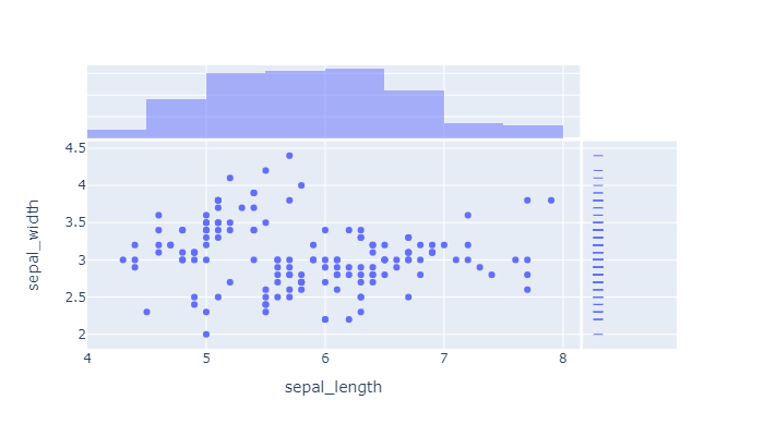
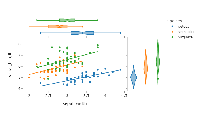
Marginal Distribution Plot
px.scatter(
    px.data.iris(),
    x="sepal_length",
    y="sepal_width",
    marginal_x="histogram",
    marginal_y="rug",
    width=500,
    height=350
).show()
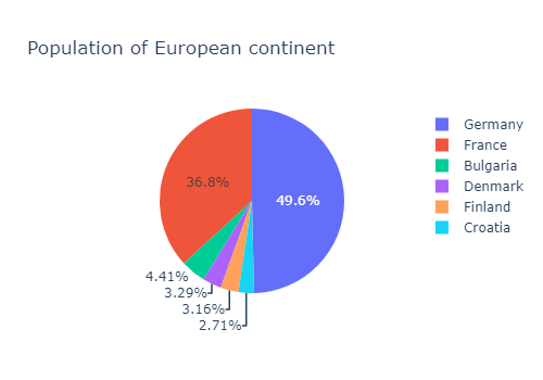
Pie chart
country_filter=[
    'Bulgaria','Croatia', 'Denmark',
    'Finland', 'France', 'Germany'
]
df = px.data.gapminder() \
    .query("country.isin(@country_filter) and year == 2007 and pop > 2.e6")

px.pie(
    df,
    values='pop',
    names='country',
    title='Population of European continent',
    width=500,
    height=350
).show()
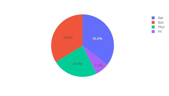
Pie chart with repeated labels
# This df has 244 lines,
# but 4 distinct values for `day`
df = px.data.tips()

px.pie(
    df,
    values='tip',
    names='day',
    width=500,
    height=350
).show()
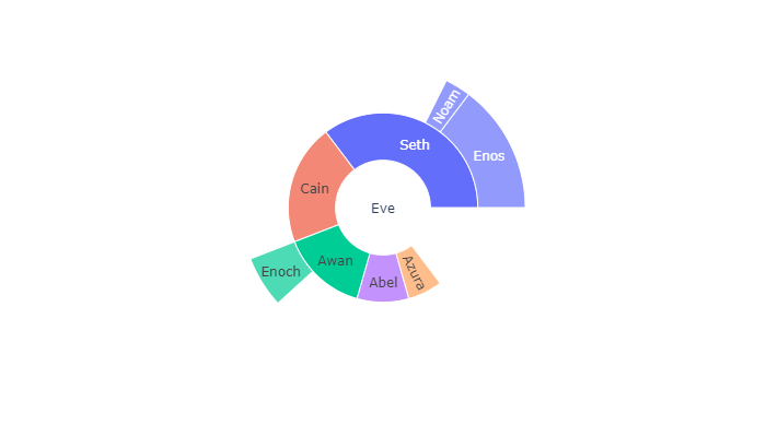
Basic Sunburst Plot
data = dict(
    character=["Eve", "Cain", "Seth", "Enos",
               "Noam", "Abel", "Awan", "Enoch",
               "Azura"],
    parent=["", "Eve", "Eve", "Seth", "Seth",
            "Eve", "Eve", "Awan", "Eve" ],
    value=[10, 14, 12, 10, 2, 6, 6, 4, 4])

px.sunburst(
    data,
    names='character',
    parents='parent',
    values='value',
    width=500,
    height=350
).show()
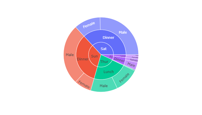
Sunburst of a rectangular DataFrame
px.sunburst(
    px.data.tips(),
    path=['day', 'time', 'sex'],
    values='total_bill',
    width=500,
    height=350
).show()
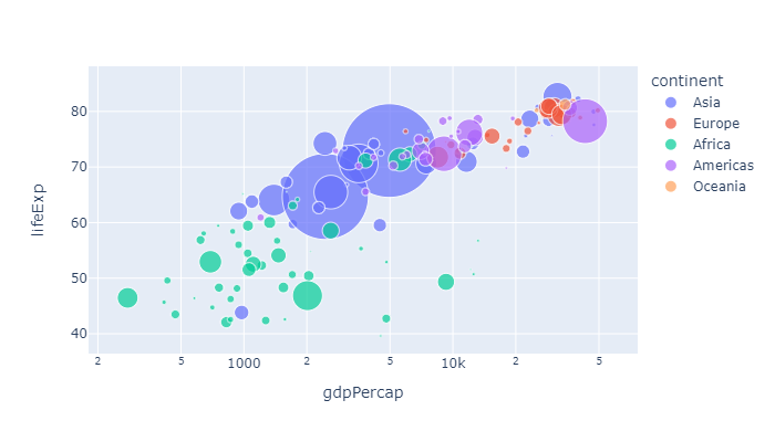
Bubble chart
px.scatter(
    px.data.gapminder().query("year==2007"),
    x="gdpPercap",
    y="lifeExp",
    size="pop",
    color="continent",
    hover_name="country",
    log_x=True,
    size_max=60,
    width=500,
    height=350
).show()
Trendsline & marginal distributions
# require statsmodel

px.scatter(
    px.data.iris(),
    x="sepal_width",
    y="sepal_length",
    color="species",
    marginal_y="violin",
    marginal_x="box",
    trendline="ols",
    template="simple_white",
    width=500,
    height=350
).show()
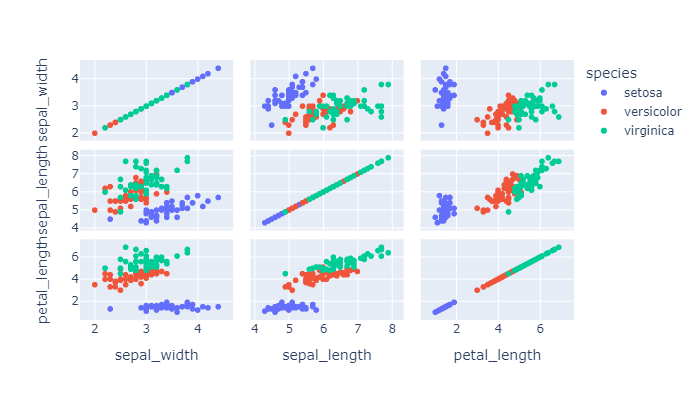
Scatter matrix
px.scatter_matrix(
    px.data.iris(),
    dimensions=["sepal_width", "sepal_length", "petal_length"],
    color="species",
    width=500,
    height=350
).show()
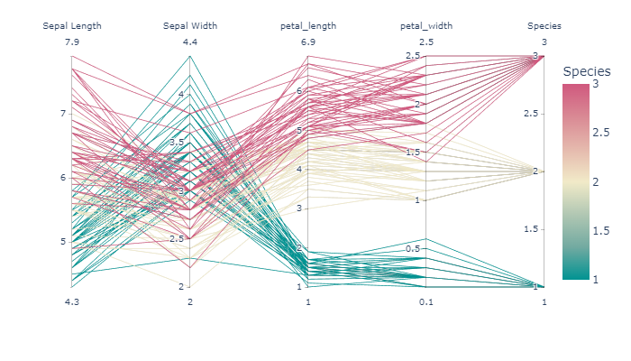
Parallel coordinates
px.parallel_coordinates(
    px.data.iris(),
    color="species_id",
    labels={"species_id": "Species",
            "sepal_width": "Sepal Width",
            "sepal_length": "Sepal Length", },
    color_continuous_scale=px.colors.diverging.Tealrose,
    color_continuous_midpoint=2,
    width=500,
    height=350
).show()
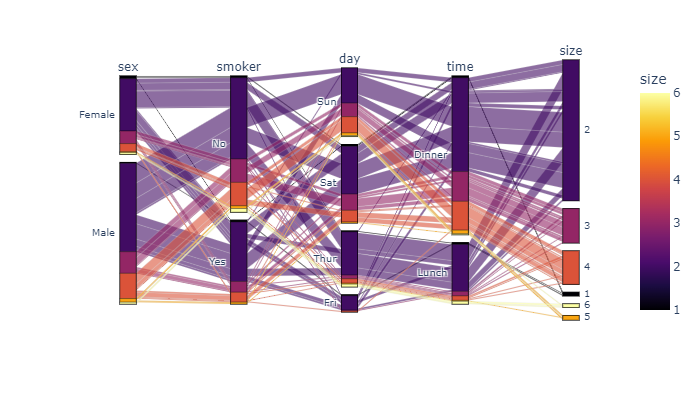
Parallel categories
px.parallel_categories(
    px.data.tips(),
    color="size",
    color_continuous_scale=px.colors.sequential.Inferno,
    width=500,
    height=350
).show()
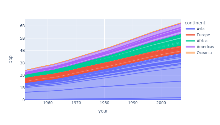
Area chart
px.area(
    px.data.gapminder(),
    x="year",
    y="pop",
    color="continent",
    line_group="country",
    width=500,
    height=350
).show()
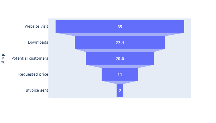
Funnel chart
data = dict(
    number=[39, 27.4, 20.6, 11, 2],
    stage=["Website visit", "Downloads",
           "Potential customers",
           "Requested price", "Invoice sent"])

px.funnel(
    data,
    x='number',
    y='stage',
    width=500,
    height=350
).show()
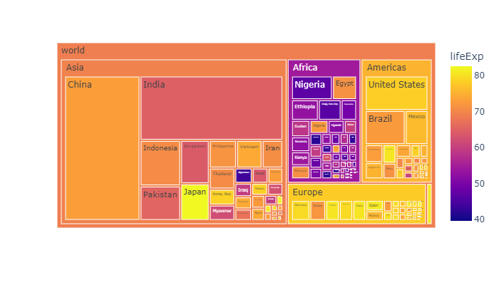
Tree map
px.treemap(
    px.data.gapminder().query("year == 2007"),
    path=[px.Constant('world'), 'continent', 'country'],
    values='pop',
    color='lifeExp',
    hover_data=['iso_alpha'],
    width=500,
    height=350
).show()
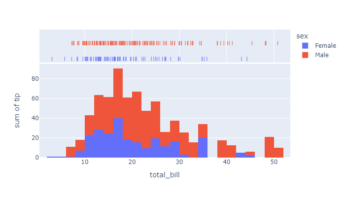
Distribution
df = px.data.tips()

px.histogram(
    df,
    x="total_bill",
    y="tip",
    color="sex",
    marginal="rug",
    hover_data=df.columns,
    width=500,
    height=350
).show()
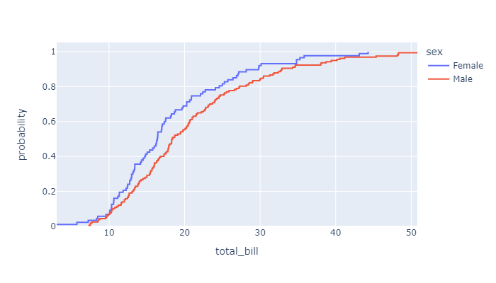
Empirical Cumulative Distribution Function chart
px.ecdf(
    px.data.tips(),
    x="total_bill",
    color="sex",
    width=500,
    height=350
).show()
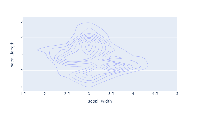
2D histogram / density contours
px.density_contour(
    px.data.iris(),
    x="sepal_width",
    y="sepal_length",
    width=500,
    height=350
).show()
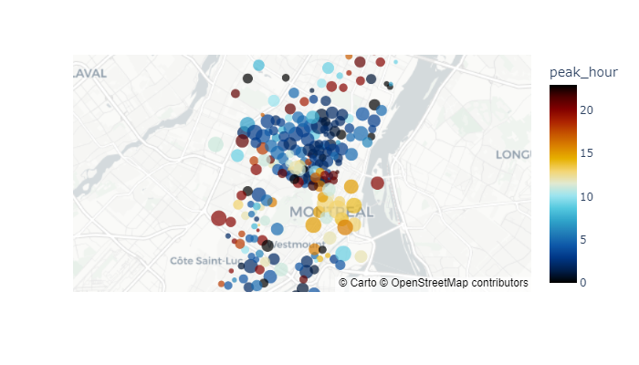
Tile map with points
px.scatter_mapbox(
    px.data.carshare(),
    lat="centroid_lat",
    lon="centroid_lon",
    color="peak_hour",
    size="car_hours",
    color_continuous_scale=px.colors.cyclical.IceFire,
    size_max=15,
    zoom=10,
    mapbox_style="carto-positron",
    width=500,
    height=350
).show()
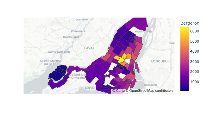
tile map GeoJSON choropleths
geojson = px.data.election_geojson()

px.choropleth_mapbox(
    px.data.election(),
    geojson=geojson,
    color="Bergeron",
    locations="district",
    featureidkey="properties.district",
    center={"lat": 45.5517, "lon": -73.7073},
    mapbox_style="carto-positron",
    zoom=9,
    width=500,
    height=350
).show()
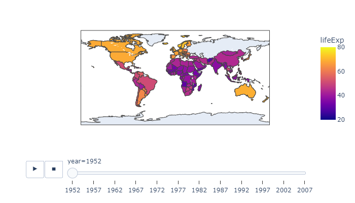
Choropleth map
px.choropleth(
    px.data.gapminder(),
    locations="iso_alpha",
    color="lifeExp",
    hover_name="country",
    animation_frame="year",
    range_color=[20,80],
    width=500,
    height=350
).show()
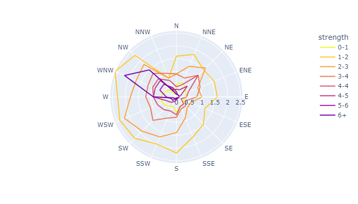
Radar chart
px.line_polar(
    px.data.wind(),
    r="frequency",
    theta="direction",
    color="strength",
    line_close=True,
    color_discrete_sequence=px.colors.sequential.Plasma_r,
    width=500,
    height=350
).show()
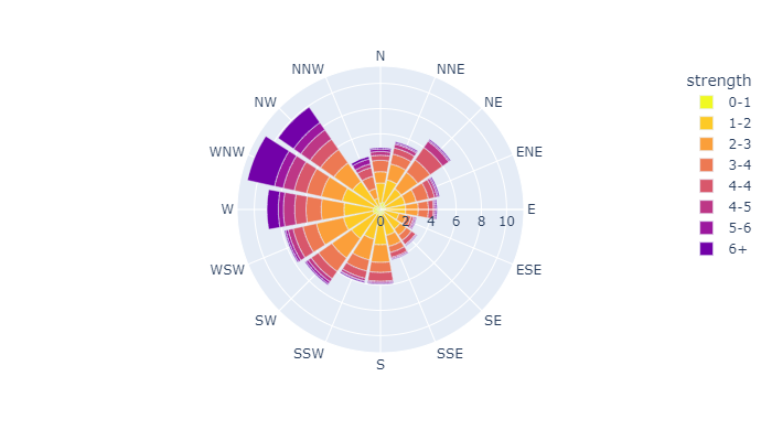
Polar bar chart
px.bar_polar(
    px.data.wind(),
    r="frequency",
    theta="direction",
    color="strength",
#     template="plotly_dark",
    color_discrete_sequence= px.colors.sequential.Plasma_r,
    width=500,
    height=350
).show()
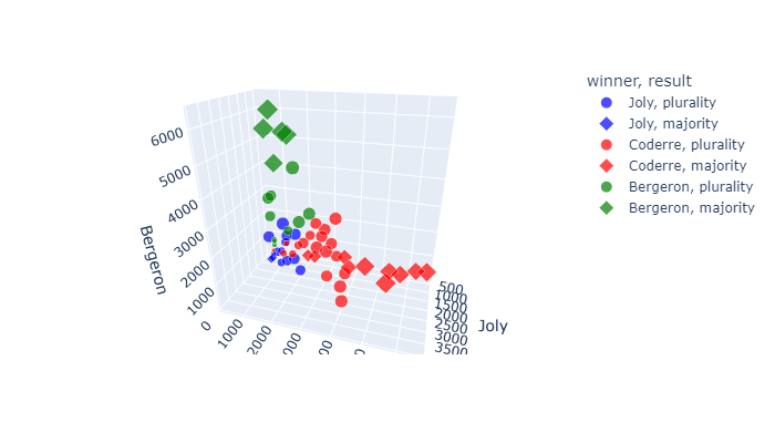
3D scatter plot
px.scatter_3d(
    px.data.election(),
    x="Joly",
    y="Coderre",
    z="Bergeron",
    color="winner",
    size="total",
    hover_name="district",
    symbol="result",
    color_discrete_map = {"Joly": "blue",
                          "Bergeron": "green",
                          "Coderre":"red"},
    width=500,
    height=350
).show()
Customization
Code pattern
# Create a plot with plotly (can be of any type)
fig = px.some_plotting_function()

# Customize and show it with .update_traces() and .show()
fig.update_traces()
fig.show()
Markers
# updates a scatter plot named fig_sct
fig_sct.update_traces(marker={
    "size" : 24,
    "color": "magenta",
    "opacity": 0.5,
    "line": {"width": 2, "color": "cyan"},
    "symbol": "square"})
fig_sct.show()
Lines
# updates a line plot named fig_ln
fig_ln.update_traces(
    patch={"line": {"dash": "dot",
                    "shape": "spline",
                    "width": 6}})
fig_ln.show()
Bars
# updates a bar plot named fig_bar
fig_bar.update_traces(
    marker={"color": "magenta",
            "opacity": 0.5,
            "line": {"width": 2, "color": "cyan"}})
fig_bar.show()


# updates a histogram named fig_hst
fig_hst.update_traces(
    marker={"color": "magenta",
            "opacity": 0.5,
            "line": {"width": 2, "color": "cyan"}})
fig_hst.show()
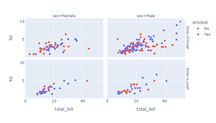
Facetting
px.scatter(
    px.data.tips(),
    x="total_bill",
    y="tip",
    color="smoker",
    facet_col="sex",
    facet_row="time",
    width=500,
    height=350
).show()
Default: various text sizes, positions and angles
country_filter=[
    'Bulgaria','Croatia', 'Denmark',
    'Finland', 'France', 'Germany'
]
df = px.data.gapminder() \
    .query("country.isin(@country_filter) and year == 2007 and pop > 2.e6")

px.bar(
    df,
    y='pop',
    x='country',
    text_auto='.2s',
    title="Default: various text sizes, positions and angles",
    width=500,
    height=350
).show()

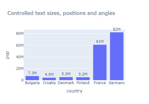
Controlled text sizes, positions and angles
country_filter=[
    'Bulgaria','Croatia', 'Denmark',
    'Finland', 'France', 'Germany'
]
df = px.data.gapminder() \
    .query("country.isin(@country_filter) and year == 2007 and pop > 2.e6")

fig = px.bar(
    df,
    y='pop',
    x='country',
    text_auto='.2s',
    title="Controlled text sizes, positions and angles",
    width=500,
    height=350
)

fig.update_traces(
    textfont_size=12,
    textangle=0,
    textposition="outside",
    cliponaxis=False
)
fig.show()