

Advanced Analysis of treadmill users, Recommendation & Clustering
Banner made from a photo by Sven Mieke on Unsplash
Introduction
Side note: all the data visualizations are interactive but it can’t be dynamic on github pages, so if you want to play with it checkount my kernel on Kaggle.
About Dataset
The market research team at AdRight is assigned the task to identify the profile of the typical customer for each treadmill product offered by CardioGood Fitness. The market research team decides to investigate whether there are differences across the product lines with respect to customer characteristics. The team decides to collect data on individuals who purchased a treadmill at a CardioGoodFitness retail store during the prior three months.
The customer variables to study are:
- product purchased: TM195, TM498, or TM798
- gender
- age, in years
- education, in years
- relationship status: single or partnered
- annual household income ($)
- average number of times the customer plans to use the treadmill each week
- average number of miles the customer expects to walk/run each week
- self-rated fitness on an 1-to-5 scale: where 1 is poor shape and 5 is excellent shape.
import numpy as np
import pandas as pd

# dataviz with plotly
import plotly.express as px
from plotly.subplots import make_subplots
import plotly.graph_objects as go
import plotly.figure_factory as ff

# for quick viz, set backend
pd.options.plotting.backend = "plotly"

# few viz are made with sns & mplt
import seaborn as sns
import matplotlib.pyplot as plt
import matplotlib.cm as cm

# stats
from scipy import stats

#from sklearn.datasets import make_blobs
from sklearn.cluster import KMeans
from sklearn.metrics import silhouette_samples, silhouette_score
from sklearn import preprocessing
from sklearn.metrics import silhouette_score

# Import module for k-protoype cluster
from kmodes.kprototypes import KPrototypes

import warnings
warnings.filterwarnings('ignore')
First insight
Let’s look at the first lines of our dataset:
df = pd.read_csv('CardioGoodFitness.csv')
df.tail()
| Product | Age | Gender | Education | MaritalStatus | Usage | Fitness | Income | Miles | |
|---|---|---|---|---|---|---|---|---|---|
| 175 | TM798 | 40 | Male | 21 | Single | 6 | 5 | 83416 | 200 |
| 176 | TM798 | 42 | Male | 18 | Single | 5 | 4 | 89641 | 200 |
| 177 | TM798 | 45 | Male | 16 | Single | 5 | 5 | 90886 | 160 |
| 178 | TM798 | 47 | Male | 18 | Partnered | 4 | 5 | 104581 | 120 |
| 179 | TM798 | 48 | Male | 18 | Partnered | 4 | 5 | 95508 | 180 |
The number of records is very low, such as the number of variables:
/!\ beware: is the dataset really representative of the treadmill users in general ? This is an open question as there are not too many records, a sample which much more lines would be more reliable ! so don’t take that all the following insights for granted…
df.shape
(180, 9)
There isn’t any missing value (Nan) and the types of each column is appropriate:
df.info()
<class 'pandas.core.frame.DataFrame'>
RangeIndex: 180 entries, 0 to 179
Data columns (total 9 columns):
 #   Column         Non-Null Count  Dtype
---  ------         --------------  -----
 0   Product        180 non-null    object
 1   Age            180 non-null    int64
 2   Gender         180 non-null    object
 3   Education      180 non-null    int64
 4   MaritalStatus  180 non-null    object
 5   Usage          180 non-null    int64
 6   Fitness        180 non-null    int64
 7   Income         180 non-null    int64
 8   Miles          180 non-null    int64
dtypes: int64(6), object(3)
memory usage: 12.8+ KB
There isn’t any duplicated lines:
df.duplicated().sum()
0
By looking at the basic statistics, we can see that
- all products were bought by people mostly between 18 and 50 years old.
- 75% of purchases were made by people below 33.
- most of the people use their treadmill around 3 times a week
- they are huge disparities in the incomes…
df.describe().T.round(1)

# if you wish to include qualitative variables:
#df.describe(include='all').T.round(2)
| count | mean | std | min | 25% | 50% | 75% | max | |
|---|---|---|---|---|---|---|---|---|
| Age | 180.0 | 28.8 | 6.9 | 18.0 | 24.0 | 26.0 | 33.0 | 50.0 |
| Education | 180.0 | 15.6 | 1.6 | 12.0 | 14.0 | 16.0 | 16.0 | 21.0 |
| Usage | 180.0 | 3.5 | 1.1 | 2.0 | 3.0 | 3.0 | 4.0 | 7.0 |
| Fitness | 180.0 | 3.3 | 1.0 | 1.0 | 3.0 | 3.0 | 4.0 | 5.0 |
| Income | 180.0 | 53719.6 | 16506.7 | 29562.0 | 44058.8 | 50596.5 | 58668.0 | 104581.0 |
| Miles | 180.0 | 103.2 | 51.9 | 21.0 | 66.0 | 94.0 | 114.8 | 360.0 |
Problem Statement
- Perform descriptive analytics to create a customer profile for each CardioGood Fitness treadmill product line.
- Improve the treadmill recommendation based on the customer informations & boost sales.
- Get more insights by clustering the customers: find the specificities of each group
Exploratory Data Analysis
The goal of EDA is to allow data scientists to get deep insight into a data set and at the same time provide specific outcomes that could be extracted from the data set. It includes:
- List of outliers
- Estimates for parameters
- Uncertainties for those estimates
- List of all important factors
- Conclusions or assumptions as to whether certain individual factors are statistically essential
- Optimal settings
- A good predictive model
Here, our analysis will also help us to make recommendation and to understand what are the specificities of the persons who use / buy treadmills.
Most of the data visualizations are made with plotly, so that they are dynamic: one can have more infos by hoovering the varisous areas of the plots. The charts can also be manipulated with the following buttons:

Univariate analysis
Let’s start with our target: the products and their quantities:
px.histogram(df, x="Product", width=500, height=400, title="Product (our target) histogram")
_histogram.png)
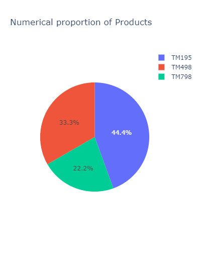
Nearly half of the product are the TM195. The TM798 is the less represented:
px.pie(
    df.groupby('Product').agg('count')[['Age']].rename(columns={'Age': 'Count'}).reset_index(),
    values='Count',
    names='Product',
    title='Numerical proportion of Products',
    width=400
)
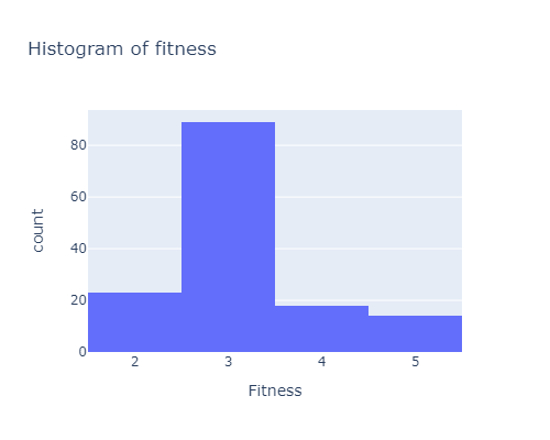
There is a number of people considering themselves in an intermediary shape. While very few people think they are in a poor shape:
px.histogram(df, x="Fitness", width=500, height=400, title="Histogram of fitness")
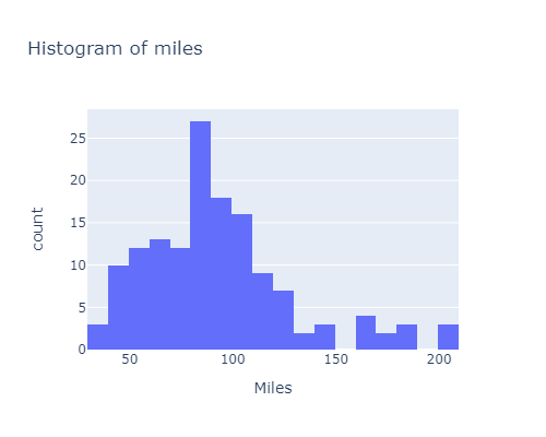
Most of the customers expect to run / walk less than 220 miles in average:
px.histogram(df, x="Miles", width=500, height=400, title="Histogram of miles")
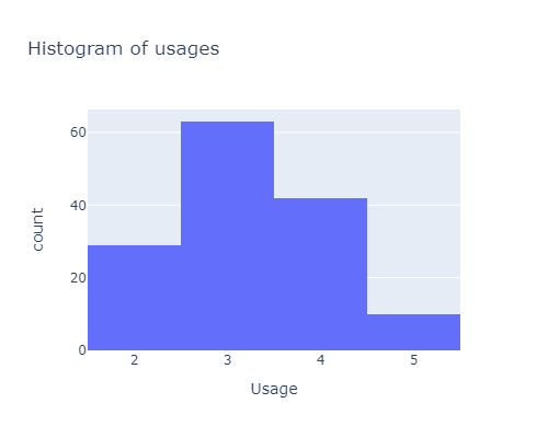
Now let’s look at the number of usage:
px.histogram(df, x="Usage", width=500, height=400, title="Histogram of usages")
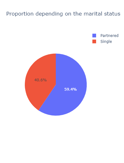
Nearly 60% of the customers are partenered:
px.pie(
    df.groupby('MaritalStatus').agg('count')[['Age']].rename(columns={'Age': 'Count'}).reset_index(),
    values='Count',
    names='MaritalStatus',
    title='Proportion depending on the marital status',
    width=400
)
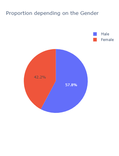
px.pie(
    df.groupby('Gender').agg('count')[['Age']].rename(columns={'Age': 'Count'}).reset_index(),
    values='Count',
    names='Gender',
    title='Proportion depending on the Gender',
    width=400
)
Bivariate Analysis
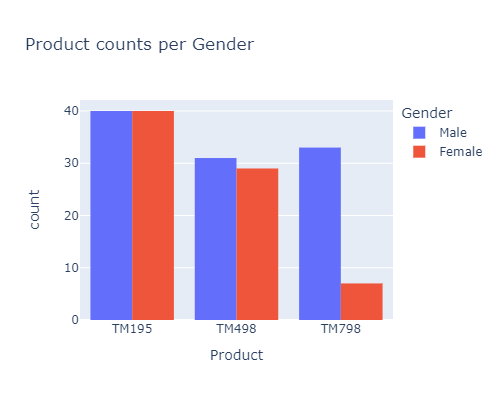
for the TM798, there far less females using / buying it than males, compared to the other products:
px.histogram(df, x="Product", color="Gender", barmode='group', width=500, height=400,
            title="Product counts per Gender")
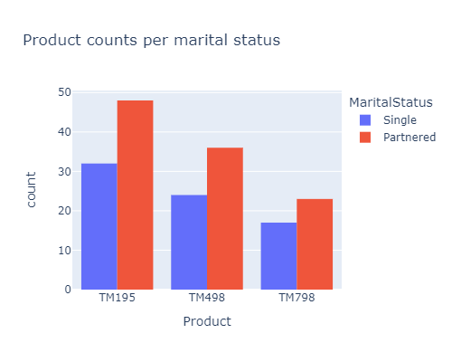
The proportion of Single / Partenered people for each product is quite the same :
px.histogram(df, x="Product", color="MaritalStatus", barmode='group', width=500, height=400,
            title="Product counts per marital status")
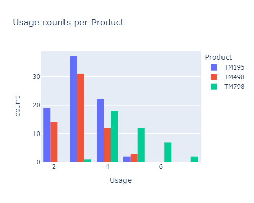
From the histogram below, it seems that:
- most of the buyers use their TM between 2 or 4 times a week
- the TM195 is mostly bought by the people that use it less.
- on the contrary the TM798 is bought by the most frequent users
px.histogram(df, x="Usage", color="Product", barmode='group', width=500, height=400,
            title="Usage counts per Product")

# same code with sns
#sns.countplot(data=df, x="Usage", hue="Product")
#plt.show()
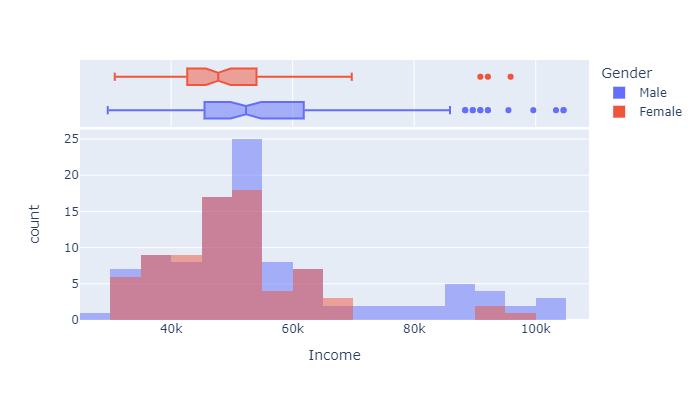
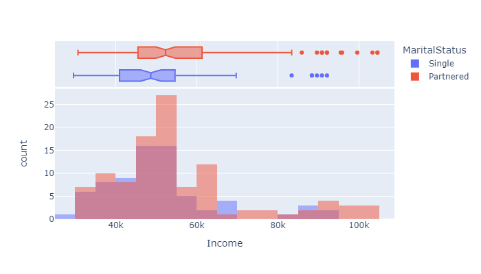
From the graph below:
- the mean income of the buyers is around 50k
- 25% of the buyers earn around 42k & 75% around 54k
- There are very few people earning more than 70k, especially women.
px.histogram(df, x="Income", color="Gender",
            marginal="box", # or violin, rug
            hover_data=df.columns,
            width=700, height=400, barmode="overlay", nbins=30
            )
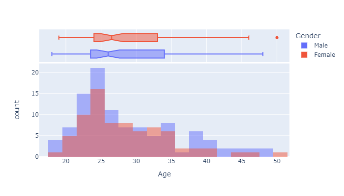
From below graph we can say that
- the mean age of the buyers is aroud 26
- 25% of the TM users are around 25
- 75% of them are around 33
px.histogram(df, x="Age", color="Gender",
            marginal="box", # or violin, rug
            hover_data=df.columns,
            width=700, height=400, barmode="overlay", nbins=30
            )
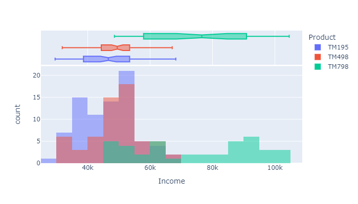
Some of the important conclusions that can be drawn by looking at the resulsts of the histogram below are:
- The TM798 is used by people with relatively high incomes
- The TM498 is bought by persons with a yearly income ranging from 45 to 55k
- while the people with lower incomes tends to use the TM195
px.histogram(df, x="Income", color="Product",
            marginal="box", # or violin, rug
            hover_data=df.columns,
            width=700, height=400, barmode="overlay", nbins=30
            )
px.histogram(df, x="Income", color="MaritalStatus",
            marginal="box", # or violin, rug
            hover_data=df.columns,
            width=700, height=400, barmode="overlay", nbins=30
            )
More infos on the histograms’ options in plotly here: ‘Histograms with Plotly Express: Complete Guide’ by Vaclav Dekanovsky
Multivariate analysis
There is no particular insights that can be seen from a scatter matrix (the code is nonetheless provided if you want to give it a try).
#pd.plotting.scatter_matrix(df, alpha=0.2, figsize=(20, 20));

#px.scatter_matrix(
#    df,
#    color="Product",
#    height=1000
#)
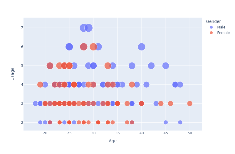
So let’s dig a little deeper with various scatter plots :
px.scatter(
    df,
    x="Age",
    y="Usage",
    color="Gender",
    size='Usage',
    width=800
)
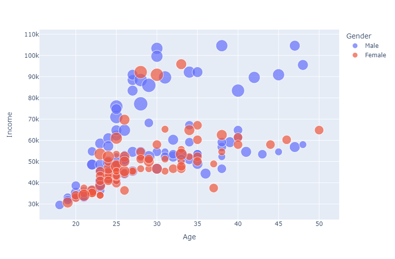
From the graph below, it seems that
- most of the women earns less than men
- there is also a positive trend which indicates that as age increases the income also increases
If you do the same thing with the MaritalStatus, there is no obvious trend that can be shown…
px.scatter(
    df,
    x="Age",
    y="Income",
    color="Gender",
    size='Usage',
    width=800
)
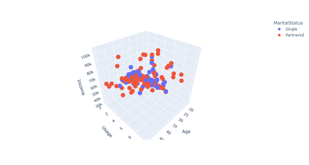
Let’s see it in 3D:
px.scatter_3d(
    df,
    x='Age',
    y='Usage',
    z='Income',
    color='MaritalStatus'
)
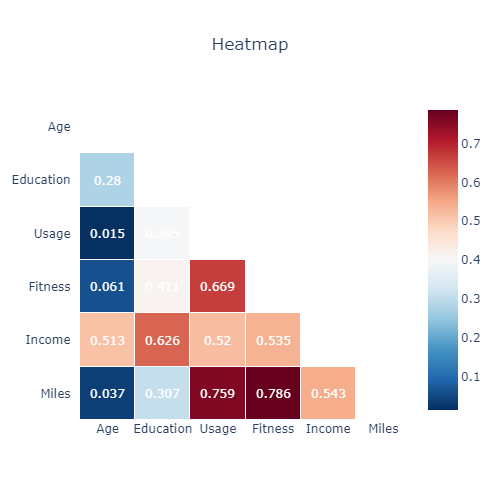
The heatmap below with a mask on its half informs us on the correlations between the quantitative variables.
- the correlation between Miles & fitness is strong
- Age is strongly related to Income
- Usage is highly correlated to income, fitness and miles
corr = df.corr().round(3)
mask = np.triu(np.ones_like(corr, dtype=bool))
df_mask = corr.mask(mask)

fig = ff.create_annotated_heatmap(z=df_mask.to_numpy(),
                                  x=df_mask.columns.tolist(),
                                  y=df_mask.columns.tolist(),

                                  # color options # reverse a built-in color scale by appending _r to its name
                                  colorscale=px.colors.diverging.RdBu_r,
                                  #colorscale=px.colors.sequential.Viridis,
                                  #colorscale=px.colors.sequential.Inferno,
                                  hoverinfo="none", #Shows hoverinfo for null values
                                  showscale=True, ygap=1, xgap=1
                                 )

fig.update_xaxes(side="bottom")

fig.update_layout(
    title_text='Heatmap',
    title_x=0.5,
    width=500,
    height=500,
    xaxis_showgrid=False,
    yaxis_showgrid=False,
    xaxis_zeroline=False,
    yaxis_zeroline=False,
    yaxis_autorange='reversed',
    template='plotly_white'
)

# NaN values are not handled automatically and are displayed in the figure
# So we need to get rid of the text manually
for i in range(len(fig.layout.annotations)):
    if fig.layout.annotations[i].text == 'nan':
        fig.layout.annotations[i].text = ""

fig.show()
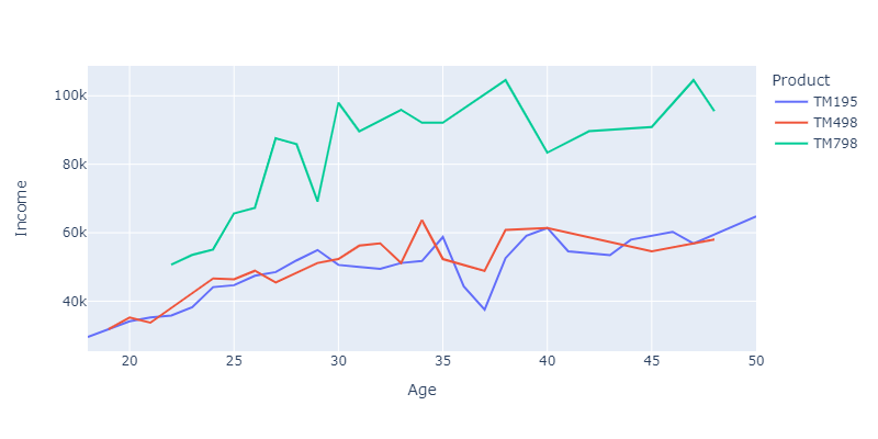
When looking at the graph below graph, we can confirm that persons with higher income tends to choose more TM798 and with age income increases.
TM498 and TM195 is more or the same across various buyers
px.line(
    df.groupby(['Age', 'Product']).agg('mean')[['Income']].reset_index(),
    x="Age",
    y="Income",
    color='Product',
    #title='Mean Age',
    width=800,
    height=400
)
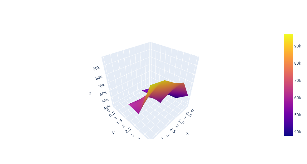
We can also visualize things in 3D - for fun :)
tmp = df.groupby(['Fitness', pd.cut(df.Age, bins=5, labels=list(range(5)))])\
    .agg('mean')[['Income']]\
    .reset_index()\
    .pivot(index='Fitness', columns='Age')

go.Figure(data=[go.Surface(z=tmp.values)])
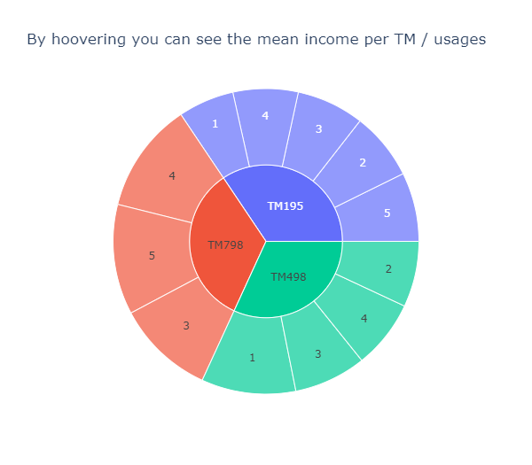
The sunburst chart is a convenient way to gain insights of the proportions depending on varisous criteria:
tmp = df.groupby(['Product', 'Fitness']).agg('mean')[['Income']].rename(columns={'Income': 'Mean Income'}).reset_index()

px.sunburst(
    tmp,
    path=['Product', 'Fitness'],
    values='Mean Income',
    #color='Income'
    width=600,
    title='By hoovering you can see the mean income per TM / usages'
)
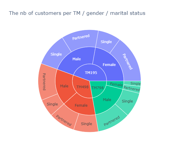
tmp = df.groupby(['Product', 'Gender', 'MaritalStatus']).agg('count')[['Age']].rename(columns={'Age': 'Count'}).reset_index()

px.sunburst(
    tmp,
    path=['Product', 'Gender', 'MaritalStatus'],
    values='Count',
    width=600,
    title='The nb of customers per TM / gender / marital status'
)
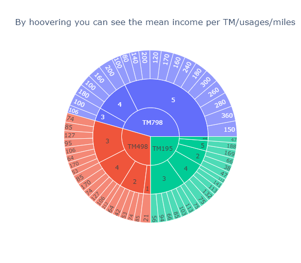
tmp = df.groupby(['Product', 'Fitness', 'Miles']).agg('mean')[['Income']].rename(columns={'Income': 'Mean Income'}).reset_index()

px.sunburst(
    tmp,
    path=['Product', 'Fitness', 'Miles'],
    values='Mean Income',
    width=600,
    title='By hoovering you can see the mean income per TM/usages/miles'
)
Recommendations
In this sections we’re going to etablish what are the specifies of each customers’ segment:
def prepare_df(_df, product, gender):
    """ prepare & return the dataframe filtered for the product and gender specified in arguments """

    # filter by product & gender
    _df = _df[(_df.Product == product) & (_df.Gender == gender)]

    #select only quantitative cols & product
    cols = [c for c in _df.columns if _df[c].dtype=="int64" or c == 'Product']
    _df = _df[cols]

    # scale between 0-5
    _df[_df.select_dtypes('number').columns] = preprocessing.MinMaxScaler().fit_transform(_df[_df.select_dtypes('number').columns])
    _df[_df.select_dtypes('number').columns] = _df[_df.select_dtypes('number').columns] * 5


    # choose a type of product and drop this col
    #_df = pd.DataFrame(_df[_df.Product == 'TM798'].drop(columns=['Product']).mean()).reset_index()
    _df = _df.groupby('Product').agg('mean').round(2).reset_index().drop(columns=['Product'])
    _df = _df.T.reset_index()

    # rename cols
    _df.columns = ['Feature', 'Mean']

    #_df = pd.DataFrame(_df[(_df.Product == product) & (_df.Gender == gender)].drop(columns=['Product']).mean()).reset_index()
    return _df
Let’s stat with the characteristics a simple segment of customers (male users of the TM798). For that the radar chart can be really convenient:
fig = px.line_polar(
    prepare_df(df, 'TM798', 'Male'),
    r='Mean',
    theta='Feature',
    line_close=True, width=400)
fig.update_traces(fill='toself')
fig.show()
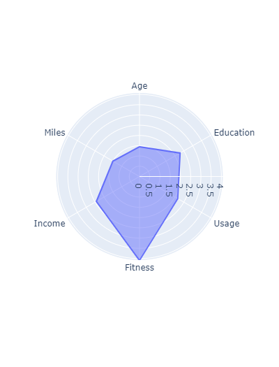
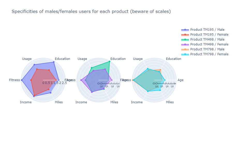
fig = make_subplots(rows=1, cols=3, specs=[[{"type": "scatterpolar"}, {"type": "scatterpolar"}, {"type": "scatterpolar"}]])

fig.add_trace(go.Scatterpolar(
    r=prepare_df(df, 'TM195', 'Male')['Mean'],
    dr=1,
    theta=prepare_df(df, 'TM195', 'Male')['Feature'],
    fill='toself',
    name='Product TM195 / Male'),
    row=1, col=1
)

fig.add_trace(go.Scatterpolar(
    r=prepare_df(df, 'TM195', 'Female')['Mean'],
    theta=prepare_df(df, 'TM195', 'Female')['Feature'],
    fill='toself',
    name='Product TM195 / Female'),
    row=1, col=1
)

fig.add_trace(go.Scatterpolar(
    r=prepare_df(df, 'TM498', 'Male')['Mean'],
    theta=prepare_df(df, 'TM498', 'Male')['Feature'],
    fill='toself',
    name='Product TM498 / Male'),
    row=1, col=2
)

fig.add_trace(go.Scatterpolar(
    r=prepare_df(df, 'TM498', 'Female')['Mean'],
    theta=prepare_df(df, 'TM498', 'Female')['Feature'],
    fill='toself',
    name='Product TM498 / Female'),
    row=1, col=2
)


fig.add_trace(go.Scatterpolar(
    r=prepare_df(df, 'TM798', 'Male')['Mean'],
    theta=prepare_df(df, 'TM798', 'Male')['Feature'],
    fill='toself',
    name='Product TM798 / Male'),
    row=1, col=3
)

fig.add_trace(go.Scatterpolar(
    r=prepare_df(df, 'TM798', 'Female')['Mean'],
    theta=prepare_df(df, 'TM798', 'Female')['Feature'],
    fill='toself',
    name='Product TM798 / Female'),
    row=1, col=3
)


fig.update_layout(height=600, width=900,
                  title_text="Specificities of males/females users for each product (beware of scales)")
fig.show()
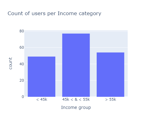
df.loc[df.Income < 45000, "Income group"] = "< 45k"
df.loc[df.Income > 55000, "Income group"] = "> 55k"
df['Income group'].fillna(value='45k < & < 55k', inplace=True)
px.histogram(df, x="Income group", width=500, height=400, title="Count of users per Income category")
# data
#df.groupby(['Gender', 'Income group']).agg('count')[['Age']].reset_index().rename(columns={'Age': 'Count'})
#df.groupby(['Income group', 'Product']).agg('count')[['Age']].reset_index().rename(columns={'Age': 'Count'})

# color palettes: https://colorhunt.co/

# sankey diagram
fig = go.Figure(data=[go.Sankey(
    node = dict(
        pad = 15,
        thickness = 20,
        line = dict(color = "black", width = 0.5),
        label = ["Male", "Female", "<45k", "[45k, 55k]", ">55k", "TM195", "TM498", "TM798"],
        color = ['#C4DDFF', '#FFC4DD', '#DEB6AB', '#F8ECD1', '#AC7D88',
                 '#187498', '#36AE7C', '#EB5353']

    ),
    link = dict(
    # indices correspond to labels
        source = [0,  0,   0,  1,  1,  1,  2,  2, 2,  3,  3, 3,  4,  4, 4],#, 5, 5, 5, 6, 6, 6, 7, 7, 7],
        target = [2,  3,   4,  2,  3,  4,  5,  6, 7,  5,  6, 7,  5,  6, 7],
        value =  [25, 42, 37, 24, 35, 17, 34, 15, 0, 35, 33, 9, 11, 12, 31],
        color = ['#C4DDFF', '#C4DDFF', '#C4DDFF', '#FFC4DD', '#FFC4DD', '#FFC4DD', '#DEB6AB',
                  '#DEB6AB', '#DEB6AB', '#F8ECD1', '#F8ECD1', '#F8ECD1', '#AC7D88', '#AC7D88', '#AC7D88']

))])

fig.update_layout(title_text="Sankey Diagram of the customers depending on their gender, income & product bought", font_size=10)
fig.show()
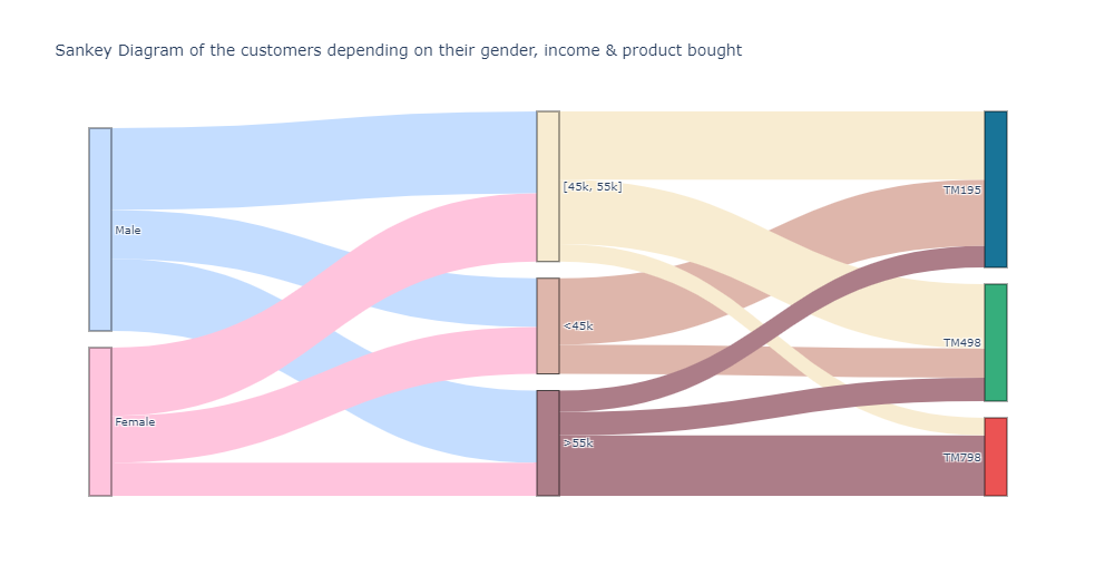
This concludes the analysis part, the sankey diagram and radare charts can deliver valuables insights in order to gain a better understanding of the treadmills buyers. Now, let’s see if we can make clusters of our customers with machine learning models:
The dataset is made of 3 categorical variables and many quantitatives ones. The most well-kown clustering model is Kmeans. But it’s not suited with qualitative predicators even one-hot encoded, more infos here
- Kmeans + one hot encoding will increase the size of the dataset extensively if the categorical attributes have a large number of categories. This will make the Kmeans computationally costly (curse of dimensionality):
this is not a problem here.
- the cluster means will make no sense since the 0 and 1 are not the real values of the data. Kmodes on the other hand produces cluster modes which are the real data and hence make the clusters interpretable.:
this is why we - at first - will use kmeans only on the numerical variables, then K-Prototype (instead of kmodes) with all features (mix of qualitative & quantitative)
Clustering with KMeans
Principle
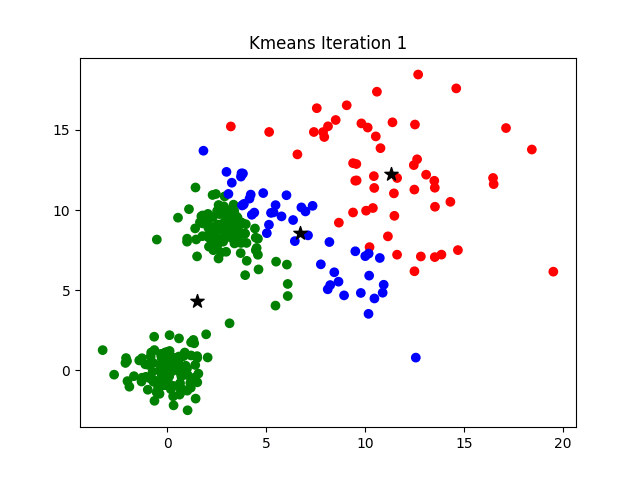
image source: K-Means Clustering Algorithm on medium by Parth Patel
If k is given, the K-means algorithm can be executed in the following steps:
- Partition of objects into k non-empty subsets
- Identifying the cluster centroids (mean point) of the current partition.
- Assigning each point to a specific cluster
- Compute the distances from each point and allot points to the cluster where the distance from the centroid is minimum.
- After re-allotting the points, find the centroid of the new cluster formed.
Requirements
Check out this excellent post on medium by Evgeniy Ryzhkov ont the data preparation before kmeans
- Numerical variables only.
K-means uses distance-based measurements to determine the similarity between data points. If you have categorical data, use K-modes clustering, if data is mixed, use K-prototype clustering.
- Data has no noises or outliers.
K-means is very sensitive to outliers and noisy data. More detail here and here.
- Data has symmetric distribution of variables (it isn’t skewed).
Real data always has outliers and noise, and it’s difficult to get rid of it. Transformation data to normal distribution helps to reduce the impact of these issues. In this way, it’s much easier for the algorithm to identify clusters.
- Variables on the same scale
have the same mean and variance, usually in a range -1.0 to 1.0 (standardized data) or 0.0 to 1.0 (normalized data). For the ML algorithm to consider all attributes as equal, they must all have the same scale. More detail here and here.
- There is no collinearity (a high level of correlation between two variables).
Correlated variables are not useful for ML segmentation algorithms because they represent the same characteristic of a segment. So correlated variables are nothing but noise. More detail here.
- Few numbers of dimensions.
As the number of dimensions (variables) increases, a distance-based similarity measure converges to a constant value between any given examples. The more variables the more difficult to find strict differences between instances.
Note: What exactly does few numbers mean? It’s an open question !
Data preparation
1) No high level of correlation & keep only numerical variables (also few nb of dimensions)
X = df[['Age', 'Education', 'Income', 'Miles']]
2) Missing or duplicated data
X.duplicated().sum()
0
X.isnull().sum()
Age          0
Education    0
Income       0
Miles        0
dtype: int64
3) Remove outliers
z_scores = np.abs(stats.zscore(X, nan_policy='omit'))
outliers_threshold = 2  # 3 means that 99.7% of the data is saved
                        # to get more smooth data, you can set 2 or 1 for this value
mask = (z_scores <= outliers_threshold).all(axis=1)
X = X[mask]
180
X.shape[0]
148
4) Symmetric distribution
#for c in X.columns:
#    df[c].plot.hist().show()
5) Scaling
# copy for later use
X_bak = X.copy()

# X alone instead of X[X.columns] returns a np array
X[X.columns] = preprocessing.MinMaxScaler().fit_transform(X[X.columns])
Results
There is no real ‘elbow’ that can be observed on the graph below:
km_inertias, km_scores = [], []

for k in range(2, 11):
    km = KMeans(n_clusters=k).fit(X)
    km_inertias.append(km.inertia_)
    km_scores.append(silhouette_score(X, km.labels_))

px.line(
    pd.DataFrame(list(zip(range(2, 11), km_inertias)), columns=['nb_clusters', 'km_inertias']),
    x="nb_clusters",
    y="km_inertias",
    title='Elbow graph / Inertia depending on k',
    width=600, height=500
)
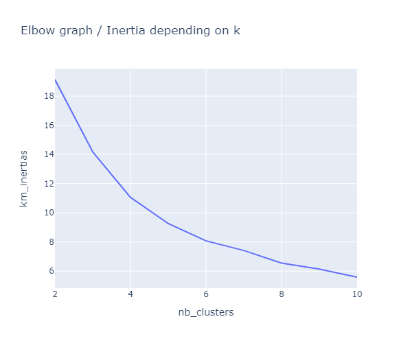
The highest score is for k=6, then in second position comes k=4:
px.line(
    pd.DataFrame(list(zip(range(2, 11), km_scores)), columns=['nb_clusters', 'km_scores']),
    x="nb_clusters",
    y="km_scores",
    title='Scores depending on k',
    width=600, height=500
)
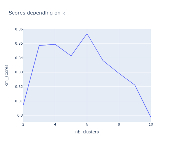
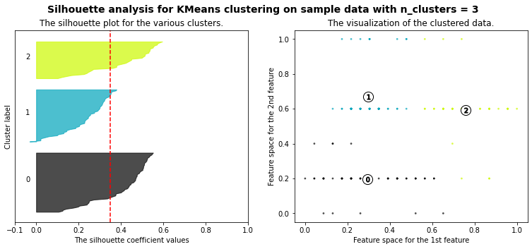
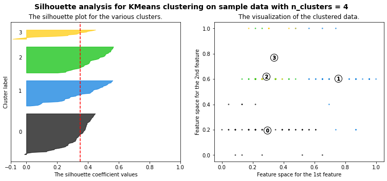
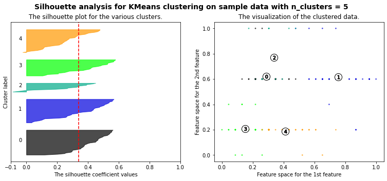
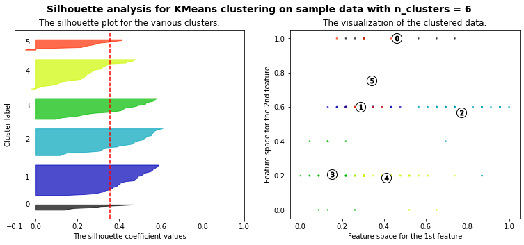
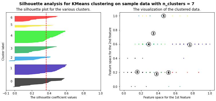
Let’s plot a kmeans silhouette analysis: the silhouette value is a measure of how similar an object is to its own cluster (cohesion) compared to other clusters (separation). The silhouette ranges from −1 to +1, where a high value indicates that the object is well matched to its own cluster and poorly matched to neighboring clusters. If most objects have a high value, then the clustering configuration is appropriate. If many points have a low or negative value, then the clustering configuration may have too many or too few clusters. (source: Wikipedia)
The best option for the value of k is not obvious, but according to the silhouette scores our best options would be 3 then 4. Taken into account all the metrics (elbow graph, scores & silhouettes), we’ll stick with k=4.
range_n_clusters = [3, 4, 5, 6, 7]

for n_clusters in range_n_clusters:
    # Create a subplot with 1 row and 2 columns
    fig, (ax1, ax2) = plt.subplots(1, 2)
    fig.set_size_inches(13, 5)

    # The 1st subplot is the silhouette plot
    # The silhouette coefficient can range from -1, 1 but in this example all
    # lie within [-0.1, 1]
    ax1.set_xlim([-0.1, 1])
    # The (n_clusters+1)*10 is for inserting blank space between silhouette
    # plots of individual clusters, to demarcate them clearly.
    ax1.set_ylim([0, len(X) + (n_clusters + 1) * 10])

    # Initialize the clusterer with n_clusters value and a random generator
    # seed of 10 for reproducibility.
    clusterer = KMeans(n_clusters=n_clusters, random_state=10)
    cluster_labels = clusterer.fit_predict(X)

    # The silhouette_score gives the average value for all the samples.
    # This gives a perspective into the density and separation of the formed
    # clusters
    silhouette_avg = silhouette_score(X, cluster_labels)
    print(
        "For n_clusters =", n_clusters,
        "The average silhouette_score is :", silhouette_avg,
    )

    # Compute the silhouette scores for each sample
    sample_silhouette_values = silhouette_samples(X, cluster_labels)

    y_lower = 10
    for i in range(n_clusters):
        # Aggregate the silhouette scores for samples belonging to
        # cluster i, and sort them
        ith_cluster_silhouette_values = sample_silhouette_values[cluster_labels == i]

        ith_cluster_silhouette_values.sort()

        size_cluster_i = ith_cluster_silhouette_values.shape[0]
        y_upper = y_lower + size_cluster_i

        color = cm.nipy_spectral(float(i) / n_clusters)
        ax1.fill_betweenx(
            np.arange(y_lower, y_upper),
            0,
            ith_cluster_silhouette_values,
            facecolor=color,
            edgecolor=color,
            alpha=0.7,
        )

        # Label the silhouette plots with their cluster numbers at the middle
        ax1.text(-0.05, y_lower + 0.5 * size_cluster_i, str(i))

        # Compute the new y_lower for next plot
        y_lower = y_upper + 10  # 10 for the 0 samples

    ax1.set_title("The silhouette plot for the various clusters.")
    ax1.set_xlabel("The silhouette coefficient values")
    ax1.set_ylabel("Cluster label")

    # The vertical line for average silhouette score of all the values
    ax1.axvline(x=silhouette_avg, color="red", linestyle="--")

    ax1.set_yticks([])  # Clear the yaxis labels / ticks
    ax1.set_xticks([-0.1, 0, 0.2, 0.4, 0.6, 0.8, 1])

    # 2nd Plot showing the actual clusters formed
    colors = cm.nipy_spectral(cluster_labels.astype(float) / n_clusters)
    ax2.scatter(
        X.iloc[:, 0], X.iloc[:, 1], marker=".", s=30, lw=0, alpha=0.7, c=colors, edgecolor="k"
    )

    # Labeling the clusters
    centers = clusterer.cluster_centers_
    # Draw white circles at cluster centers
    ax2.scatter(
        centers[:, 0],
        centers[:, 1],
        marker="o",
        c="white",
        alpha=1,
        s=200,
        edgecolor="k",
    )

    for i, c in enumerate(centers):
        ax2.scatter(c[0], c[1], marker="$%d$" % i, alpha=1, s=50, edgecolor="k")

    ax2.set_title("The visualization of the clustered data.")
    ax2.set_xlabel("Feature space for the 1st feature")
    ax2.set_ylabel("Feature space for the 2nd feature")

    plt.suptitle(
        "Silhouette analysis for KMeans clustering on sample data with n_clusters = %d"
        % n_clusters,
        fontsize=14,
        fontweight="bold",
    )

plt.show()
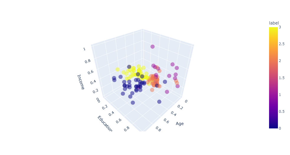
In order to visualize the clusters property in a 3D space, let’s retrain our model with the our best bet value of k and plot a scatter :
nb_clusters = 4
km = KMeans(n_clusters=nb_clusters).fit(X)

# K-Means visualization on pair of 2 features
#plt.figure(figsize=(10, 6))
#sns.scatterplot(X.iloc[:, 1], X.iloc[:, 2], hue=km.labels_)
#plt.show()

# Definition of customers profiles corresponding to each clustersPermalink
# Profiles of customers
X['label'] = km.labels_
#X.label.value_counts()
px.scatter_3d(
    X,
    x='Age',
    y='Education',
    z='Income',
    color='label',
    opacity=0.5
)
# description of each cluster
for k in range(nb_clusters):
    print(f'cluster nb : {k+1}')
    print(X_bak[X.label == k].describe().round(0).astype(int).iloc[[0, 1, 3, 7], :-1])
    print('\n\n')
cluster nb : 1
       Age  Education  Income
count   15         15      15
mean    26         17   60633
min     22         16   44343
max     34         18   83416


cluster nb : 2
       Age  Education  Income
count   59         59      59
mean    25         14   42971
min     18         13   29562
max     33         15   57987


cluster nb : 3
       Age  Education  Income
count   38         38      38
mean    25         16   46910
min     21         16   34110
max     29         18   61006


cluster nb : 4
       Age  Education  Income
count   36         36      36
mean    36         16   55377
min     31         14   37521
max     41         18   67083
Clustering with K-Prototype
Principle
Source / Reference: Audhi Aprilliant
- K-Means is calculated using the Euclidian distance that is only suitable for numerical data.
- While K-Mode is only suitable for categorical data only, not mixed data types.
- K-Prototype was created to handle mixed data types (numerical and categorical variables). This clustering method is based on partitioning. It’s an improvement of both the K-Means and K-Mode models.
The K-Prototype clustering algorithm in kmodes module needs categorical variables or columns position in the data. This task aims to save those in a given variables cat_cols_positions. It will be added for the next task in cluster analysis. The categorical column position is in the first four columns in the data.
# Get the position of categorical columns
cat_cols_positions = [df.columns.get_loc(col) for col in list(df.select_dtypes('object').columns)]
print('Categorical columns           : {}'.format(list(df.select_dtypes('object').columns)))
print('Categorical columns position  : {}'.format(cat_cols_positions))
Categorical columns           : ['Product', 'Gender', 'MaritalStatus']
Categorical columns position  : [0, 2, 4]
Data preparation
z_scores = np.abs(stats.zscore(df.select_dtypes('number'), nan_policy='omit'))
outliers_threshold = 2  # 3 means that 99.7% of the data is saved
                        # to get more smooth data, you can set 2 or 1 for this value
mask = (z_scores <= outliers_threshold).all(axis=1)
df = df[mask]

# backup of the data for later
df_bak = df.copy()

df.shape[0]
144
num_cols = list(df.select_dtypes('number').columns)
df[num_cols] = preprocessing.MinMaxScaler().fit_transform(df[num_cols])
df.head()
| Product | Age | Gender | Education | MaritalStatus | Usage | Fitness | Income | Miles | |
|---|---|---|---|---|---|---|---|---|---|
| 0 | TM195 | 0.000000 | Male | 0.2 | Single | 0.333333 | 0.666667 | 0.000000 | 0.456790 |
| 1 | TM195 | 0.043478 | Male | 0.4 | Single | 0.000000 | 0.333333 | 0.042225 | 0.228395 |
| 2 | TM195 | 0.043478 | Female | 0.2 | Partnered | 0.666667 | 0.333333 | 0.021113 | 0.172840 |
| 4 | TM195 | 0.086957 | Male | 0.0 | Partnered | 0.666667 | 0.000000 | 0.105563 | 0.055556 |
| 5 | TM195 | 0.086957 | Female | 0.2 | Partnered | 0.333333 | 0.333333 | 0.063338 | 0.172840 |
Next, convert the data from the data frame to the matrix. It helps the kmodes module running the K-Prototype clustering algorithm. Save the data matrix to the variable df_matrix.
# Convert dataframe to matrix
df_matrix = df.to_numpy()
df_matrix
array([['TM195', 0.0, 'Male', ..., 0.6666666666666666, 0.0,
        0.4567901234567901],
       ['TM195', 0.0434782608695653, 'Male', ..., 0.33333333333333337,
        0.04222527574553425, 0.22839506172839502],
       ['TM195', 0.0434782608695653, 'Female', ..., 0.33333333333333337,
        0.02111263787276718, 0.1728395061728395],
       ...,
       ['TM798', 0.34782608695652173, 'Male', ..., 0.6666666666666666,
        0.6532291009024399, 0.8765432098765433],
       ['TM798', 0.3913043478260869, 'Male', ..., 0.9999999999999999,
        1.0, 0.7530864197530864],
       ['TM798', 0.4782608695652175, 'Male', ..., 0.9999999999999999,
        0.42202993278122336, 0.8765432098765433]], dtype=object)
df_matrix.shape
(144, 9)
We are using the Elbow method to determine the optimal number of clusters for K-Prototype clusters. Instead of calculating the within the sum of squares errors (WSSE) with Euclidian distance, K-Prototype provides the cost function that combines the calculation for numerical and categorical variables. We can look into the Elbow to determine the optimal number of clusters.
# Choose optimal K using Elbow method
cost, nb_clusters = [], range(2, 10)
for cluster in nb_clusters:
    try:
        kprototype = KPrototypes(n_jobs=-1, n_clusters=cluster, init='Huang', random_state=0)
        kprototype.fit_predict(df_matrix, categorical=cat_cols_positions)
        cost.append(kprototype.cost_)
        print('Cluster initiation: {}'.format(cluster))
    except:
        break

# Converting the results into a dataframe and plotting them
df_cost = pd.DataFrame({'Cluster':nb_clusters, 'Cost':cost})
Cluster initiation: 2
Cluster initiation: 3
Cluster initiation: 4
Cluster initiation: 5
Cluster initiation: 6
Cluster initiation: 7
Cluster initiation: 8
Cluster initiation: 9
px.line(
    df_cost,
    x="Cluster",
    y="Cost",
    title='Cost depending on k',
    width=600, height=500
)
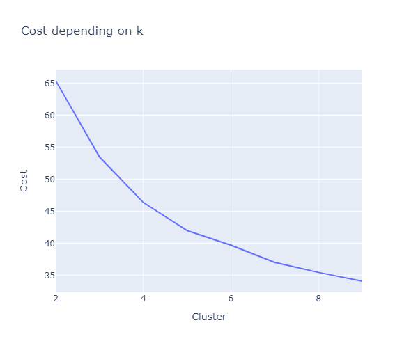
According to the plot of cost function above, we consider choosing the number of cluster k = 4. But once again, there is no “real elbow” here… It will be the optimal number of clusters for K-Prototype cluster analysis. Read more about the Elbow method here.
# Fit the cluster
kprototype = KPrototypes(n_jobs=-1, n_clusters=4, init='Huang', random_state=0)
kprototype.fit_predict(df_matrix, categorical=cat_cols_positions)
array([2, 2, 2, 2, 3, 3, 2, 2, 3, 2, 3, 2, 2, 2, 3, 2, 2, 3, 2, 2, 2, 1,
       2, 3, 2, 3, 3, 3, 3, 2, 3, 2, 3, 2, 3, 2, 3, 2, 2, 3, 2, 3, 3, 3,
       2, 3, 2, 3, 0, 3, 0, 2, 2, 3, 3, 2, 2, 3, 3, 1, 3, 0, 0, 0, 3, 0,
       3, 3, 0, 0, 0, 0, 2, 2, 3, 2, 3, 2, 2, 2, 0, 3, 3, 0, 3, 2, 2, 3,
       2, 3, 2, 2, 3, 2, 2, 3, 3, 2, 0, 1, 2, 2, 3, 3, 2, 0, 3, 0, 0, 0,
       3, 0, 0, 0, 0, 0, 0, 3, 0, 0, 0, 0, 0, 0, 0, 0, 0, 2, 1, 1, 1, 1,
       1, 1, 1, 1, 1, 1, 1, 1, 0, 1, 1, 1], dtype=uint16)
We can print the centroids of cluster using kprototype.cluster_centroids_. For the numerical variables, it will be using the average while the categorical using the mode.
print(f"Cluster centorid: {kprototype.cluster_centroids_}\n\n"
      f"Nb of iterations: {kprototype.n_iter_}\n\n"
      f"Cost of the cluster creation: {kprototype.cost_:.2f}\n\n"
)
Cluster centorid: [['0.6969696969696969' '0.6242424242424243' '0.45454545454545386'
  '0.3535353535353531' '0.49131040039793344' '0.3338945005611671' 'TM498'
  'Male' 'Partnered']
 ['0.30434782608695654' '0.7111111111111109' '0.7777777777777776'
  '0.9259259259259258' '0.4861281324403841' '0.6858710562414267' 'TM798'
  'Male' 'Single']
 ['0.2708333333333334' '0.33749999999999986' '0.486111111111111'
  '0.38194444444444414' '0.2515021323083399' '0.36612654320987653'
  'TM195' 'Male' 'Single']
 ['0.3971014492753625' '0.3377777777777775' '0.148148148148148'
  '0.19999999999999973' '0.29604609994924563' '0.16941015089163208'
  'TM195' 'Female' 'Partnered']]

Nb of iterations: 11

Cost of the cluster creation: 39.74
The interpretation of clusters is needed. The interpretation is using the centroids in each cluster. To do so, we need to append the cluster labels to the raw data. Order the cluster labels will be helpful to arrange the interpretation based on cluster labels.
# retrieve the unscaled values
df = df_bak

# Add the cluster to the dataframe
df['Cluster Labels'] = kprototype.labels_
df['Segment'] = df['Cluster Labels'].map({0:'First', 1:'Second', 2:'Third', 3:'Fourth'})

# Order the cluster
df['Segment'] = df['Segment'].astype('category')
df['Segment'] = df['Segment'].cat.reorder_categories(['First','Second','Third', 'Fourth'])

df.tail()
| Product | Age | Gender | Education | MaritalStatus | Usage | Fitness | Income | Miles | Cluster Labels | Segment | |
|---|---|---|---|---|---|---|---|---|---|---|---|
| 152 | TM798 | 25 | Female | 18 | Partnered | 5 | 5 | 61006 | 200 | 1 | Second |
| 153 | TM798 | 25 | Male | 18 | Partnered | 4 | 3 | 64741 | 100 | 0 | First |
| 158 | TM798 | 26 | Male | 16 | Partnered | 5 | 4 | 64741 | 180 | 1 | Second |
| 159 | TM798 | 27 | Male | 16 | Partnered | 4 | 5 | 83416 | 160 | 1 | Second |
| 165 | TM798 | 29 | Male | 18 | Single | 5 | 5 | 52290 | 180 | 1 | Second |
To interpret the cluster, for the numerical variables, it will be using the average while the categorical using the mode. But there are other methods that can be implemented such as using median, percentile, or value composition for categorical variables.
# Cluster interpretation
df.rename(columns = {'Cluster Labels':'Total'}, inplace = True)
df.groupby('Segment').agg(
    {
        'Total':'count',
        'Product': lambda x: x.value_counts().index[0],
        'Age': lambda x: x.value_counts().index[0],
        'Gender': lambda x: x.value_counts().index[0],
        'MaritalStatus': lambda x: x.value_counts().index[0],
        'Education': 'mean',
        'Usage': 'mean',
        'Fitness': 'mean',
        'Income': 'mean',
        'Miles': 'mean'
    }
).round(1).reset_index().set_index('Segment')
| Total | Product | Age | Gender | MaritalStatus | Education | Usage | Fitness | Income | Miles | |
|---|---|---|---|---|---|---|---|---|---|---|
| Segment | ||||||||||
| First | 33 | TM498 | 35 | Male | Partnered | 16.1 | 3.4 | 3.1 | 56021.0 | 92.1 |
| Second | 18 | TM798 | 24 | Male | Single | 16.6 | 4.3 | 4.8 | 55741.9 | 149.1 |
| Third | 48 | TM195 | 23 | Male | Single | 14.7 | 3.5 | 3.1 | 43106.4 | 97.3 |
| Fourth | 45 | TM195 | 25 | Female | Partnered | 14.7 | 2.4 | 2.6 | 45505.3 | 65.4 |
Conclusion
We have use 2 different approaches to gain insights of the TM customers:
- first, after an advanced analysis of the various features, we were able to categorize customers, especially depending of the product bought with the radare charts
- then, we’ve used the kmeans and kprototypes clustering models: it seems that the later is more accurate. The kprototype clusters take into account all the variables even the categorical ones. The last output just above this conclusion shows the specifities of each clusters. It can be really valuable for marketing or CRM purposes.
We could also have tried the Dbscan clustering model (with a dendogram). It can also be informative (but it will be for a later)…
I hope you’ve enjoyed this study and thank you for reading it :)
References:
- Correlation heatmap with plotly
- CardioGood - Descriptive Statistics & Probability by MAYANK
- ‘Histograms with Plotly Express: Complete Guide’ by Vaclav Dekanovsky
- Cardio Visualization by NIMA JEHAN
- Data preparation requirements before kmeans by Evgeniy Ryzhkov
- Kmodes vs one-hot encoding kmeans for categorical data
- K-Means Clustering Algorithm image animation on medium by Parth Patel
- Plot kmeans silhouette analysis
- The k-prototype as Clustering Algorithm for Mixed Data Type (Categorical and Numerical) by Audhi Aprilliant
- Export animated plotly charts
I also recommend the excellent blog post on K-prototypes by Anton Ruberts
