

Solar energy generation 2/3 - exploratory data analysis
Introduction
This dataset contains hourly estimates of an area’s energy potential for 1986-2015 as a percentage of a power plant’s maximum output.
In the previous part, we’ve made clusters of countries with similar profiles of solar generation. In this 2nd part we’re going to analyse and explore datas for one country representative of each cluster. As a reminder, here are what those 6 clusters made of :
- cluster nb : 0 CY IE NO SE
- cluster nb : 1 AT CH CZ HR HU IT SI SK
- cluster nb : 2 BE DE DK FR LU NL UK
- cluster nb : 3 EE FI LT LV PL
- cluster nb : 4 BG EL RO
- cluster nb : 5 ES PT
Goals
- Assess the impact of meteorological and climate variability on the generation of solar power in Europe.
- Understand how the datas are structured
- Determine how clean is the dataset? Older solar estimates used to contain impossible values around sunset (ie more energy than the sun releases) or negative sunlight.
- Show what does a typical year look like? One common approach is to stitch together 12 months of raw data, using the 12 most typical months per this ISO standard.
First look
Let’s see the first rows of our data set :
import numpy as np
import pandas as pd
from scipy import stats
import seaborn as sns
import matplotlib.pyplot as plt

pd.options.display.max_columns = 300

import warnings
warnings.filterwarnings("ignore")

df_solar_co = pd.read_csv("solar_generation_by_country.csv")
df_solar_co.head(2)
| AT | BE | BG | CH | CY | CZ | DE | DK | EE | ES | FI | FR | EL | HR | HU | IE | IT | LT | LU | LV | NL | NO | PL | PT | RO | SI | SK | SE | UK | |
|---|---|---|---|---|---|---|---|---|---|---|---|---|---|---|---|---|---|---|---|---|---|---|---|---|---|---|---|---|---|
| 0 | 0.0 | 0.0 | 0.0 | 0.0 | 0 | 0.0 | 0.0 | 0.0 | 0.0 | 0.0 | 0.0 | 0.0 | 0.0 | 0.0 | 0.0 | 0.0 | 0.0 | 0.0 | 0.0 | 0.0 | 0.0 | 0.0 | 0.0 | 0.0 | 0.0 | 0.0 | 0.0 | 0.0 | 0.0 |
| 1 | 0.0 | 0.0 | 0.0 | 0.0 | 0 | 0.0 | 0.0 | 0.0 | 0.0 | 0.0 | 0.0 | 0.0 | 0.0 | 0.0 | 0.0 | 0.0 | 0.0 | 0.0 | 0.0 | 0.0 | 0.0 | 0.0 | 0.0 | 0.0 | 0.0 | 0.0 | 0.0 | 0.0 | 0.0 |
We keep only one country of each cluster, and take a look a the end of the data set :
df_solar_co = df_solar_co[['NO', 'AT', 'FR', 'FI', 'RO', 'ES']]
df_solar_co.tail(2)
| NO | AT | FR | FI | RO | ES | |
|---|---|---|---|---|---|---|
| 262966 | 0.0 | 0.0 | 0.0 | 0.0 | 0.0 | 0.0 |
| 262967 | 0.0 | 0.0 | 0.0 | 0.0 | 0.0 | 0.0 |
Data cleaning and preparation
Until now we’ve consider that all datas are clean and “normal”, but is it really the case ? We can easily verify that values are indeed between 0 and 1 :
print("Number of negative values :")
(df_solar_co[['NO', 'AT', 'FR', 'FI', 'RO', 'ES']] < 0).sum()
Number of negative values :


NO    0
AT    0
FR    0
FI    0
RO    0
ES    0
dtype: int64
print("Number of values greater than 1 :")
(df_solar_co[['NO', 'AT', 'FR', 'FI', 'RO', 'ES']] > 1).sum()
Number of values greater than 1 :


NO    0
AT    0
FR    0
FI    0
RO    0
ES    0
dtype: int64
Now, we have to add date time informations in order to use the data :
def add_time(_df):
    "Returns a DF with two new cols : the time and hour of the day"
    t = pd.date_range(start='1/1/1986', periods=df_solar_co.shape[0], freq = 'H')
    t = pd.DataFrame(t)
    _df = pd.concat([_df, t], axis=1)
    _df.rename(columns={ _df.columns[-1]: "time" }, inplace = True)
    _df['hour'] = _df['time'].dt.hour
    _df['month'] = _df['time'].dt.month
    _df['week'] = _df['time'].dt.week
    return _df

df_solar_co = add_time(df_solar_co)
df_solar_co.tail(2)
| NO | AT | FR | FI | RO | ES | time | hour | month | week | |
|---|---|---|---|---|---|---|---|---|---|---|
| 262966 | 0.0 | 0.0 | 0.0 | 0.0 | 0.0 | 0.0 | 2015-12-31 22:00:00 | 22 | 12 | 53 |
| 262967 | 0.0 | 0.0 | 0.0 | 0.0 | 0.0 | 0.0 | 2015-12-31 23:00:00 | 23 | 12 | 53 |
Data Analysis
Considering night and day
Obviously there is no generation of energy during the night :) But first we’re goint to take a look at the distribution of the values of solar efficiency during different spans of time and generally. Let’s begin with the last day of the records :
def plot_hourly(df, title):
    plt.figure(figsize=(12, 6))
    for c in df.columns:
        if c != 'hour':
            sns.lineplot(x="hour", y=c, data=df, label=c)
            #plt.legend(c)
    plt.title(title)
    plt.show()

plot_hourly(df_solar_co[df_solar_co.columns.difference(['time', 'month', 'week'])][-24:], "Efficiency of solar stations per country during the last 24 hours")
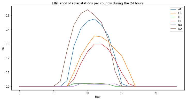
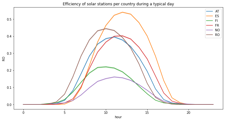
Values are normally distributed : the plot looks like a typical Gaussian distribution. The maximum efficiency during the day may vary among countries. Further more, there is an offset along the horizontal axis. This can be explain by the differnet longitude, the sun don’t appear at the same hour depending on countries. Those observations can also be seen if we plot the means of those value during the hours of the day :
plot_hourly(df_solar_co[df_solar_co.columns.difference(['time', 'month', 'week'])], "Mean solar efficiency per country during the day")
Now let’s look at a statistical distribution of the station’s efficiencies for non null values (ie during the day), we can see that there are still many values (see the spike) around zero :
temp_df = df_solar_co[df_solar_co.columns.difference(['time', 'hour', 'month', 'week'])]
plt.figure(figsize=(12, 6))
for col in temp_df.columns:
    sns.distplot(temp_df[temp_df[col] != 0][col], label=col, hist=False)
plt.title("Distribution of the station's efficiency for non null values (ie during the day)")
Text(0.5, 1.0, "Distribution of the station's efficiency for non null values (ie during the day)")

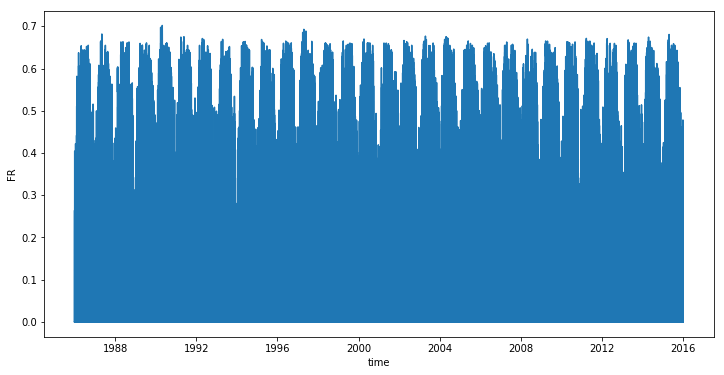
What about the evolution during the recorded years ? For each year there are a spike :
plt.figure(figsize=(12, 6))
sns.lineplot(x = df_solar_co.time, y = df_solar_co['FR'])
<matplotlib.axes._subplots.AxesSubplot at 0x7fea5e095ef0>
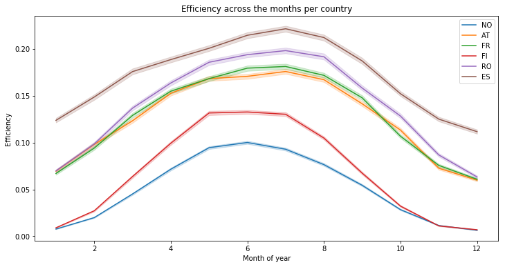
In order to understand more accurately this phenomenon, let’s plot the mean values per month. As we can see, solar efficiency is better during the summer (which can be easily understood) : :
countries = ['NO', 'AT', 'FR', 'FI', 'RO', 'ES']

plt.figure(figsize=(12, 6))
for c in countries:
    temp_df = df_solar_co[[c, 'month']]
    sns.lineplot(x=temp_df["month"], y=temp_df[c], label=c)

plt.xlabel("Month of year")
plt.ylabel("Efficiency")
plt.title("Efficiency across the months per country")
Text(0.5, 1.0, 'Efficiency across the months per country')
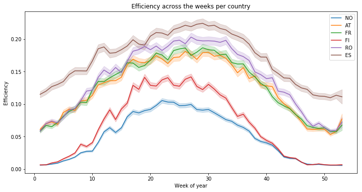
We can observe the same thing, with means on a week basis, there is finally no real variations :
plt.figure(figsize=(12, 6))
for c in countries:
    temp_df = df_solar_co[[c, 'week']]
    sns.lineplot(x=temp_df["week"], y=temp_df[c], label=c)

plt.xlabel("Week of year")
plt.ylabel("Efficiency")
plt.title("Efficiency across the weeks per country")
Text(0.5, 1.0, 'Efficiency across the weeks per country')
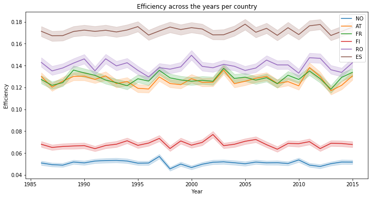
We create a temporary dataframe with the year, in order to see the variation of the mean solar efficiency accross 30 years. As you can see, the solar generation is quite the same years after years :
temp_df = df_solar_co.copy()
temp_df['year'] = temp_df['time'].dt.year


plt.figure(figsize=(12, 6))
for c in countries:
    temp_df_ = temp_df[[c, 'year']]
    sns.lineplot(x=temp_df_["year"], y=temp_df_[c], label=c)

plt.xlabel("Year")
plt.ylabel("Efficiency")
plt.title("Efficiency across the years per country")
Text(0.5, 1.0, 'Efficiency across the years per country')
Considering ONLY values between 5 AM & 10 PM
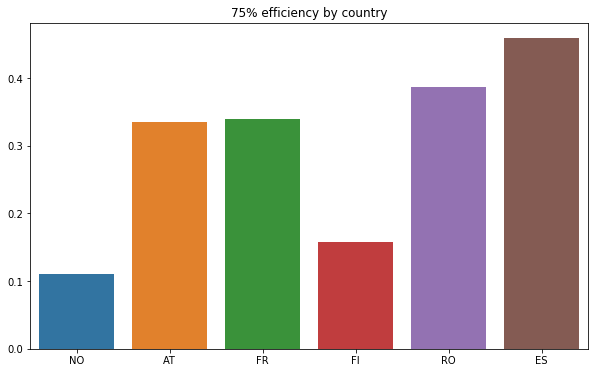
We’re going to take an other look at the distribution of the values but this same considering only during the sunlight hours of the day. Let’s begin with a summary of the statistics :
temp_df = df_solar_co[(5 < df_solar_co.hour) & (df_solar_co.hour < 22)]
temp_df = temp_df.drop(columns=['time', 'hour', 'month', 'week'])
temp_df.describe()
| NO | AT | FR | FI | RO | ES | |
|---|---|---|---|---|---|---|
| count | 175312.000000 | 175312.000000 | 175312.000000 | 175312.000000 | 175312.000000 | 175312.000000 |
| mean | 0.075220 | 0.187375 | 0.191680 | 0.099533 | 0.204717 | 0.257699 |
| std | 0.103796 | 0.191641 | 0.187002 | 0.142873 | 0.211509 | 0.228028 |
| min | 0.000000 | 0.000000 | 0.000000 | 0.000000 | 0.000000 | 0.000000 |
| 25% | 0.000000 | 0.000000 | 0.000000 | 0.000000 | 0.000000 | 0.000000 |
| 50% | 0.025330 | 0.131469 | 0.147011 | 0.020212 | 0.133705 | 0.233841 |
| 75% | 0.111076 | 0.335664 | 0.339958 | 0.157080 | 0.386842 | 0.458925 |
| max | 0.487921 | 0.715303 | 0.701985 | 0.615942 | 0.722990 | 0.793842 |
Then, we can plot the values of the 3rd quartile (splits off the highest 25% of data from the lowest 75%) for each country :
def plot_by_country(_df, title, nb_col):
    _df = _df.describe().iloc[nb_col, :]
    plt.figure(figsize=(10, 6))
    sns.barplot(x=_df.index, y=_df.values)
    plt.title(title)

#plot_by_country("Mean efficiency by country", 1)
plot_by_country(temp_df, "75% efficiency by country", 6)
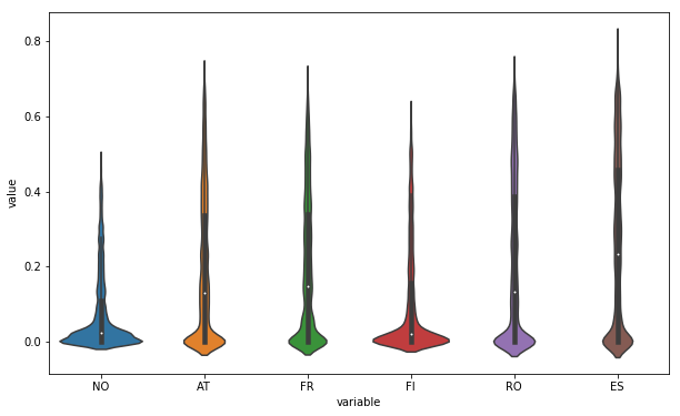
An other way to look at the distribution can be achieved with violin plots (a method of plotting numeric data. It is similar to a box plot, with the addition of a rotated kernel density plot on each side) :
# credits : https://stackoverflow.com/questions/49554139/boxplot-of-multiple-columns-of-a-pandas-dataframe-on-the-same-figure-seaborn
# This works because pd.melt converts a wide-form dataframe
plt.figure(figsize=(10, 6))
sns.violinplot(x="variable", y="value", data=pd.melt(temp_df))
<matplotlib.axes._subplots.AxesSubplot at 0x7fea5df1e128>
Just for fun, we can also use box plot as previously mentionned (In descriptive statistics, a box plot or boxplot is a method for graphically depicting groups of numerical data through their quartiles) :
plt.figure(figsize=(10, 6))
sns.boxplot(x="variable", y="value", data=pd.melt(temp_df))
<matplotlib.axes._subplots.AxesSubplot at 0x7fea5de6b3c8>
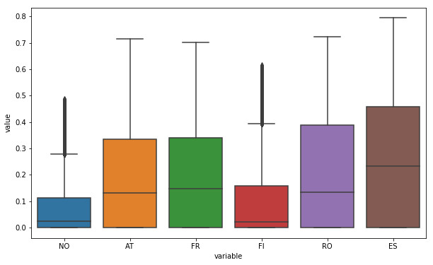
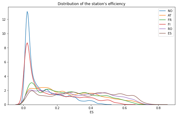
And finally the distribution, we can see that Norway and Finland present many more values around zero :
plt.figure(figsize=(10, 6))
for col in temp_df.columns:
    sns.distplot(temp_df[temp_df[col] != 0][col], label=col, hist=False)
plt.title("Distribution of the station's efficiency")
Text(0.5, 1.0, "Distribution of the station's efficiency")
## Correlations
Is there any dependence between the solar generation among countries ?
In statistics, correlation or dependence is any statistical relationship, whether causal or not, between two random variables. In the broadest sense correlation is any statistical association, though it commonly refers to the degree to which a pair of variables are linearly related.
Correlations are useful because they can indicate a predictive relationship that can be exploited in practice.
def plot_corr(df_):
    corr = df_.corr()
    corr

    # Generate a mask for the upper triangle
    mask = np.zeros_like(corr, dtype=np.bool)
    mask[np.triu_indices_from(mask)] = True

    # Set up the matplotlib figure
    f, ax = plt.subplots(figsize=(9, 7))

    # Generate a custom diverging colormap
    #cmap = sns.diverging_palette(220, 10, as_cmap=True)

    # Draw the heatmap with the mask and correct aspect ratio
    sns.heatmap(corr, mask=mask, center=0, square=True, cmap='Spectral', linewidths=.5, cbar_kws={"shrink": .5}) #annot=True

plot_corr(temp_df)

Since values are higher than 0.6, there are considered highly positively correlated. Once again, this is not suprising because the countries are situated close each others, so the sun has a tendency to rise and set at the same time and in the same way for all those countries. An other way to see those correlations is to show the following matrix :
temp_df.corr()
| NO | AT | FR | FI | RO | ES | |
|---|---|---|---|---|---|---|
| NO | 1.000000 | 0.668562 | 0.724858 | 0.723009 | 0.648708 | 0.641740 |
| AT | 0.668562 | 1.000000 | 0.818610 | 0.684129 | 0.819165 | 0.741216 |
| FR | 0.724858 | 0.818610 | 1.000000 | 0.646947 | 0.718909 | 0.888815 |
| FI | 0.723009 | 0.684129 | 0.646947 | 1.000000 | 0.718531 | 0.547065 |
| RO | 0.648708 | 0.819165 | 0.718909 | 0.718531 | 1.000000 | 0.653520 |
| ES | 0.641740 | 0.741216 | 0.888815 | 0.547065 | 0.653520 | 1.000000 |
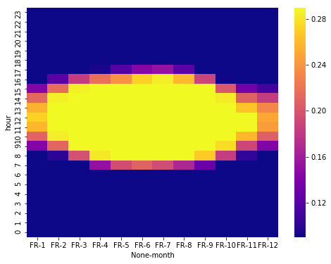
Heatmap month vs hours
# credits S Godinho @ https://www.kaggle.com/sgodinho/wind-energy-potential-prediction

df_solar_co['year'] = df_solar_co['time'].dt.year
plt.figure(figsize=(8, 6))
temp_df = df_solar_co[['FR', 'month', 'hour']]
temp_df = temp_df.groupby(['hour', 'month']).mean()
temp_df = temp_df.unstack('month').sort_index(ascending=False)
sns.heatmap(temp_df, vmin = 0.09, vmax = 0.29, cmap = 'plasma')
<matplotlib.axes._subplots.AxesSubplot at 0x7fea5e095e48>
Conclusion
In this second part, we’ve explored the data set in order to assess the impact of meteorological and climate variability on the generation of solar power. We’ve also shown the variation during the day, the months of the year and accross years. The dataset seems to be clean and a function to add date time informations is already implemented. It will be usefull in the third and final part of this study where we’ll train machine learning models to make predictions.
