

Forecast of city bikeshare system’s use / rentals
Banner photo by Christian Stahl
Context
Bike sharing systems are a means of renting bicycles where the process of obtaining membership, rental, and bike return is automated via a network of kiosk locations throughout a city. Using these systems, people are able rent a bike from a one location and return it to a different place on an as-needed basis. Currently, there are over 500 bike-sharing programs around the world.
The data generated by these systems makes them attractive for researchers because the duration of travel, departure location, arrival location, and time elapsed is explicitly recorded. Bike sharing systems therefore function as a sensor network, which can be used for studying mobility in a city. In this competition, participants are asked to combine historical usage patterns with weather data in order to forecast bike rental demand in the Capital Bikeshare program in Washington, D.C.
Goal
Forecast use of a city bikeshare system
Exploratory Data Analysis
import numpy as np
import pandas as pd
from scipy import stats
import seaborn as sns
import matplotlib.pyplot as plt

pd.options.display.max_columns = 100

import warnings
warnings.filterwarnings("ignore")
from sklearn.svm import LinearSVR
from sklearn.neighbors import KNeighborsRegressor
from sklearn.linear_model import LinearRegression, Ridge, Lasso, ElasticNet
from sklearn.ensemble import RandomForestRegressor, GradientBoostingRegressor, ExtraTreesRegressor
from sklearn.model_selection import GridSearchCV
from sklearn import metrics
from sklearn.model_selection import train_test_split
from sklearn.metrics import mean_squared_error
from sklearn.pipeline import Pipeline
from sklearn.preprocessing import StandardScaler, PolynomialFeatures
import xgboost as xgb
import lightgbm as lgbm
Let’s see the head of the data set
df = pd.read_csv("../input/train.csv")
df.head()
| datetime | season | holiday | workingday | weather | temp | atemp | humidity | windspeed | casual | registered | count | |
|---|---|---|---|---|---|---|---|---|---|---|---|---|
| 0 | 2011-01-01 00:00:00 | 1 | 0 | 0 | 1 | 9.84 | 14.395 | 81 | 0.0 | 3 | 13 | 16 |
| 1 | 2011-01-01 01:00:00 | 1 | 0 | 0 | 1 | 9.02 | 13.635 | 80 | 0.0 | 8 | 32 | 40 |
| 2 | 2011-01-01 02:00:00 | 1 | 0 | 0 | 1 | 9.02 | 13.635 | 80 | 0.0 | 5 | 27 | 32 |
| 3 | 2011-01-01 03:00:00 | 1 | 0 | 0 | 1 | 9.84 | 14.395 | 75 | 0.0 | 3 | 10 | 13 |
| 4 | 2011-01-01 04:00:00 | 1 | 0 | 0 | 1 | 9.84 | 14.395 | 75 | 0.0 | 0 | 1 | 1 |
The dataset contains the following columns:
datetime - hourly date + timestamp
season -  1 = spring, 2 = summer, 3 = fall, 4 = winter
holiday - whether the day is considered a holiday
workingday - whether the day is neither a weekend nor holiday
weather - 1: Clear, Few clouds, Partly cloudy, Partly cloudy
2: Mist + Cloudy, Mist + Broken clouds, Mist + Few clouds, Mist
3: Light Snow, Light Rain + Thunderstorm + Scattered clouds, Light Rain + Scattered clouds
4: Heavy Rain + Ice Pallets + Thunderstorm + Mist, Snow + Fog
temp - temperature in Celsius
atemp - "feels like" temperature in Celsius
humidity - relative humidity
windspeed - wind speed
casual - number of non-registered user rentals initiated
registered - number of registered user rentals initiated
count - number of total rentals
‘count’ is the target, all other columns are features.
The value of ‘count’ is equal to casual plus register
df.shape
(10886, 12)
df.info()
<class 'pandas.core.frame.DataFrame'>
RangeIndex: 10886 entries, 0 to 10885
Data columns (total 12 columns):
datetime      10886 non-null object
season        10886 non-null int64
holiday       10886 non-null int64
workingday    10886 non-null int64
weather       10886 non-null int64
temp          10886 non-null float64
atemp         10886 non-null float64
humidity      10886 non-null int64
windspeed     10886 non-null float64
casual        10886 non-null int64
registered    10886 non-null int64
count         10886 non-null int64
dtypes: float64(3), int64(8), object(1)
memory usage: 1020.6+ KB
There are basiclly 3 types of data:
- data concerning the weather
- for time infos
- linked to the number of users
No Nan, it seems that there isn’t any missing value. All types seem to be corresponding to the meaning of the data except the ‘datetime’ column wich is an object not a pandas’ datetime Let’s see the basic statistics:
df.describe()
| season | holiday | workingday | weather | temp | atemp | humidity | windspeed | casual | registered | count | |
|---|---|---|---|---|---|---|---|---|---|---|---|
| count | 10886.000000 | 10886.000000 | 10886.000000 | 10886.000000 | 10886.00000 | 10886.000000 | 10886.000000 | 10886.000000 | 10886.000000 | 10886.000000 | 10886.000000 |
| mean | 2.506614 | 0.028569 | 0.680875 | 1.418427 | 20.23086 | 23.655084 | 61.886460 | 12.799395 | 36.021955 | 155.552177 | 191.574132 |
| std | 1.116174 | 0.166599 | 0.466159 | 0.633839 | 7.79159 | 8.474601 | 19.245033 | 8.164537 | 49.960477 | 151.039033 | 181.144454 |
| min | 1.000000 | 0.000000 | 0.000000 | 1.000000 | 0.82000 | 0.760000 | 0.000000 | 0.000000 | 0.000000 | 0.000000 | 1.000000 |
| 25% | 2.000000 | 0.000000 | 0.000000 | 1.000000 | 13.94000 | 16.665000 | 47.000000 | 7.001500 | 4.000000 | 36.000000 | 42.000000 |
| 50% | 3.000000 | 0.000000 | 1.000000 | 1.000000 | 20.50000 | 24.240000 | 62.000000 | 12.998000 | 17.000000 | 118.000000 | 145.000000 |
| 75% | 4.000000 | 0.000000 | 1.000000 | 2.000000 | 26.24000 | 31.060000 | 77.000000 | 16.997900 | 49.000000 | 222.000000 | 284.000000 |
| max | 4.000000 | 1.000000 | 1.000000 | 4.000000 | 41.00000 | 45.455000 | 100.000000 | 56.996900 | 367.000000 | 886.000000 | 977.000000 |
At first glance, when we look at the temp / atemp min, it seems strange that no negative temperature is recorded…
Weather informations analysis
plt.figure(figsize=(8, 4))
sns.distplot(df.temp, bins=10, label='real temp.')
sns.distplot(df.atemp, bins=10, label='feels like temp.')
plt.legend()
plt.show()
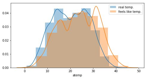
One can see an offset between the real temperature and the “feels like” temperature. This can probably explained by the fact that temperature on a bike is different. But the distributions looks the same. More, there is a clear correlation between the 2 features.
plt.figure(figsize=(4, 4))
sns.scatterplot(df.atemp, df.temp)
plt.show()
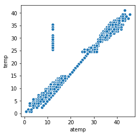
Let’s see if the difference between the 2 features is quite the same…
df['Delta'] = df.temp - df.atemp
sns.lineplot(x=df.index, y=df.Delta)
<matplotlib.axes._subplots.AxesSubplot at 0x7fa54c4cf588>
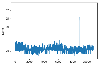
There are few abnormal values corresponding to the spike in the above plot.
df[df.Delta > 5].head()
| datetime | season | holiday | workingday | weather | temp | atemp | humidity | windspeed | casual | registered | count | Delta | |
|---|---|---|---|---|---|---|---|---|---|---|---|---|---|
| 8991 | 2012-08-17 00:00:00 | 3 | 0 | 1 | 1 | 27.88 | 12.12 | 57 | 11.0014 | 21 | 67 | 88 | 15.76 |
| 8992 | 2012-08-17 01:00:00 | 3 | 0 | 1 | 1 | 27.06 | 12.12 | 65 | 7.0015 | 16 | 38 | 54 | 14.94 |
| 8993 | 2012-08-17 02:00:00 | 3 | 0 | 1 | 1 | 27.06 | 12.12 | 61 | 8.9981 | 4 | 15 | 19 | 14.94 |
| 8994 | 2012-08-17 03:00:00 | 3 | 0 | 1 | 1 | 26.24 | 12.12 | 65 | 7.0015 | 0 | 6 | 6 | 14.12 |
| 8995 | 2012-08-17 04:00:00 | 3 | 0 | 1 | 1 | 26.24 | 12.12 | 73 | 11.0014 | 0 | 9 | 9 | 14.12 |
df[(df.atemp >= 12) & (df.atemp <= 12.5)].head()
| datetime | season | holiday | workingday | weather | temp | atemp | humidity | windspeed | casual | registered | count | Delta | |
|---|---|---|---|---|---|---|---|---|---|---|---|---|---|
| 59 | 2011-01-03 14:00:00 | 1 | 0 | 1 | 1 | 10.66 | 12.12 | 30 | 19.0012 | 11 | 66 | 77 | -1.46 |
| 60 | 2011-01-03 15:00:00 | 1 | 0 | 1 | 1 | 10.66 | 12.12 | 30 | 16.9979 | 14 | 58 | 72 | -1.46 |
| 61 | 2011-01-03 16:00:00 | 1 | 0 | 1 | 1 | 10.66 | 12.12 | 30 | 16.9979 | 9 | 67 | 76 | -1.46 |
| 109 | 2011-01-05 18:00:00 | 1 | 0 | 1 | 1 | 9.84 | 12.12 | 38 | 8.9981 | 3 | 166 | 169 | -2.28 |
| 115 | 2011-01-06 00:00:00 | 1 | 0 | 1 | 1 | 7.38 | 12.12 | 55 | 0.0000 | 0 | 11 | 11 | -4.74 |
All those measures have been recorded the same day. During that day ‘temp’ changed but not ‘atemp’ The ‘atemp’ value seems strange even during other few days… Because those 2 features are correlated, we only need to keep one. This is more safe to keep temp instead of atemp
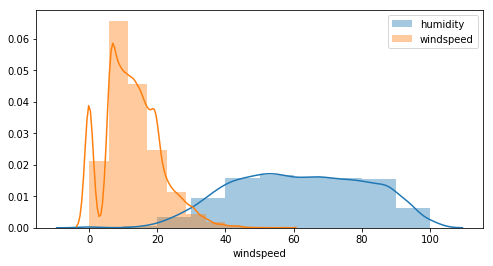
Is there also a correlation between humidity and windspeed ?
plt.figure(figsize=(8, 4))
sns.distplot(df.humidity, bins=10, label='humidity')
sns.distplot(df.windspeed, bins=10, label='windspeed')
plt.legend()
plt.show()
sns.pairplot(df[['temp', 'atemp', 'humidity', 'windspeed']])
<seaborn.axisgrid.PairGrid at 0x7fa547823a58>
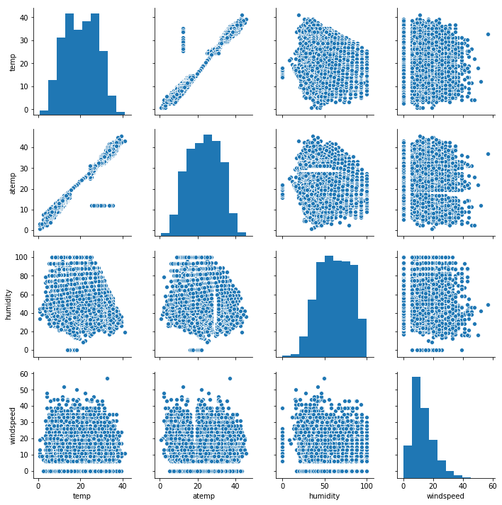
Except for the temperature, there is no clear correlation between other features. Furthermore:
- humidity vs atemp there is something strange with missing value like a void in the scatter
- for all windspeed plots there are null values and beginning values start at 5, that’s probably because the sensor can detect low values…this needs to be investigated further.
Modification of time data
df['casual_percentage'] = df['casual'] / df['count']
df['registered_percentage'] = df['registered'] / df['count']
def change_datetime(df):
    """ Modify the col datetime to create other cols: dow, month, week..."""
    df["datetime"] = pd.to_datetime(df["datetime"])
    df["dow"] = df["datetime"].dt.dayofweek
    df["month"] = df["datetime"].dt.month
    df["week"] = df["datetime"].dt.week
    df["hour"] = df["datetime"].dt.hour
    df["year"] = df["datetime"].dt.year
    df["season"] = df.season.map({1: "Winter", 2 : "Spring", 3 : "Summer", 4 :"Fall" })
    df["month_str"] = df.month.map({1: "Jan ", 2 : "Feb", 3 : "Mar", 4 : "Apr", 5: "May", 6: "Jun", 7: "Jul", 8: "Aug", 9: "Sep", 10: "Oct", 11: "Nov", 12: "Dec" })
    df["dow_str"] = df.dow.map({5: "Sat", 6 : "Sun", 0 : "Mon", 1 :"Tue", 2 : "Wed", 3 : "Thu", 4: "Fri" })
    df["weather_str"] = df.weather.map({1: "Good", 2 : "Normal", 3 : "Bad", 4 :"Very Bad"})
    return df


df = change_datetime(df)
df.head()
| datetime | season | holiday | workingday | weather | temp | atemp | humidity | windspeed | casual | registered | count | Delta | casual_percentage | registered_percentage | dow | month | week | hour | year | month_str | dow_str | weather_str | |
|---|---|---|---|---|---|---|---|---|---|---|---|---|---|---|---|---|---|---|---|---|---|---|---|
| 0 | 2011-01-01 00:00:00 | Winter | 0 | 0 | 1 | 9.84 | 14.395 | 81 | 0.0 | 3 | 13 | 16 | -4.555 | 0.187500 | 0.812500 | 5 | 1 | 52 | 0 | 2011 | Jan | Sat | Good |
| 1 | 2011-01-01 01:00:00 | Winter | 0 | 0 | 1 | 9.02 | 13.635 | 80 | 0.0 | 8 | 32 | 40 | -4.615 | 0.200000 | 0.800000 | 5 | 1 | 52 | 1 | 2011 | Jan | Sat | Good |
| 2 | 2011-01-01 02:00:00 | Winter | 0 | 0 | 1 | 9.02 | 13.635 | 80 | 0.0 | 5 | 27 | 32 | -4.615 | 0.156250 | 0.843750 | 5 | 1 | 52 | 2 | 2011 | Jan | Sat | Good |
| 3 | 2011-01-01 03:00:00 | Winter | 0 | 0 | 1 | 9.84 | 14.395 | 75 | 0.0 | 3 | 10 | 13 | -4.555 | 0.230769 | 0.769231 | 5 | 1 | 52 | 3 | 2011 | Jan | Sat | Good |
| 4 | 2011-01-01 04:00:00 | Winter | 0 | 0 | 1 | 9.84 | 14.395 | 75 | 0.0 | 0 | 1 | 1 | -4.555 | 0.000000 | 1.000000 | 5 | 1 | 52 | 4 | 2011 | Jan | Sat | Good |
Rentals / target analysis
sns.kdeplot(data=df['count'])
<matplotlib.axes._subplots.AxesSubplot at 0x7fa5472d17b8>
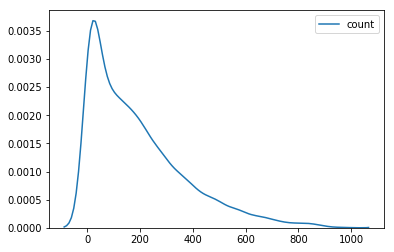
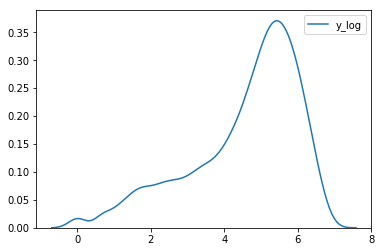
df['y_log'] = np.log(df['count'])
sns.kdeplot(data=df['y_log'])
<matplotlib.axes._subplots.AxesSubplot at 0x7fa5452d5e80>
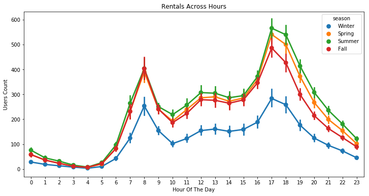
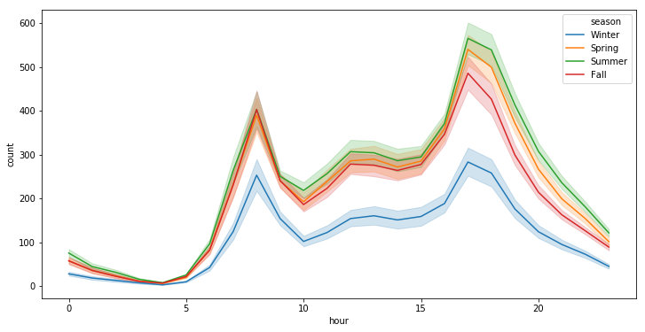
plt.figure(figsize=(12, 6))
sns.pointplot(x=df["hour"], y=df["count"], hue=df["season"])
plt.xlabel("Hour Of The Day")
plt.ylabel("Users Count")
plt.title("Rentals Across Hours")
plt.show()
plt.figure(figsize=(12, 6))
sns.lineplot(x="hour", y="count", hue="season", data=df)
<matplotlib.axes._subplots.AxesSubplot at 0x7fa5452ca518>
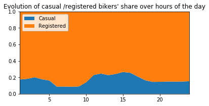
# ---------------------------------------------------------
plt.figure(figsize=(6,3))
plt.stackplot(range(1,25),
df.groupby(['hour'])['casual_percentage'].mean(),
df.groupby(['hour'])['registered_percentage'].mean(),
labels=['Casual','Registered'])
plt.legend(loc='upper left')
plt.margins(0,0)
plt.title("Evolution of casual /registered bikers' share over hours of the day")
# ---------------------------------------------------------
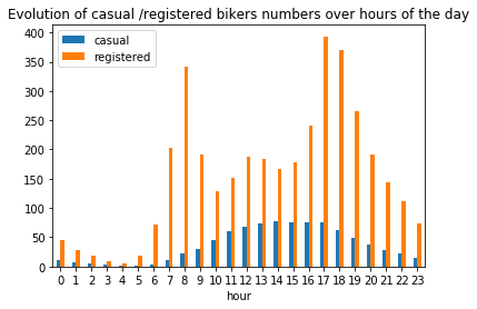
plt.figure(figsize=(6,6))
df_hours = pd.DataFrame(
{"casual" : df.groupby(['hour'])['casual'].mean().values,
"registered" : df.groupby(['hour'])['registered'].mean().values},
index = df.groupby(['hour'])['casual'].mean().index)
df_hours.plot.bar(rot=0)
plt.title("Evolution of casual /registered bikers numbers over hours of the day")
# ---------------------------------------------------------
plt.show()
<Figure size 432x432 with 0 Axes>
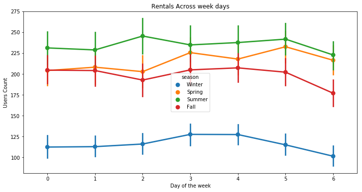
plt.figure(figsize=(12, 6))
sns.pointplot(x=df["dow"], y=df["count"], hue=df["season"])
plt.xlabel("Day of the week")
plt.ylabel("Users Count")
plt.title("Rentals Across week days")
plt.show()
# ---------------------------------------------------------
plt.figure(figsize=(6,3))
plt.stackplot(range(1,8),
df.groupby(['dow'])['casual_percentage'].mean(),
df.groupby(['dow'])['registered_percentage'].mean(),
labels=['Casual','Registered'])
plt.legend(loc='upper left')
plt.margins(0,0)
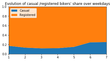
plt.title("Evolution of casual /registered bikers' share over weekdays")
# ---------------------------------------------------------
plt.figure(figsize=(6,6))
df_hours = pd.DataFrame(
{"casual" : df.groupby(['dow'])['casual'].mean().values,
"registered" : df.groupby(['dow'])['registered'].mean().values},
index = df.groupby(['dow'])['casual'].mean().index)
df_hours.plot.bar(rot=0)
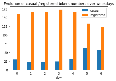
plt.title("Evolution of casual /registered bikers numbers over weekdays")
# ---------------------------------------------------------
plt.show()
<Figure size 432x432 with 0 Axes>
fig, ax = plt.subplots()
fig.set_size_inches(10, 8)
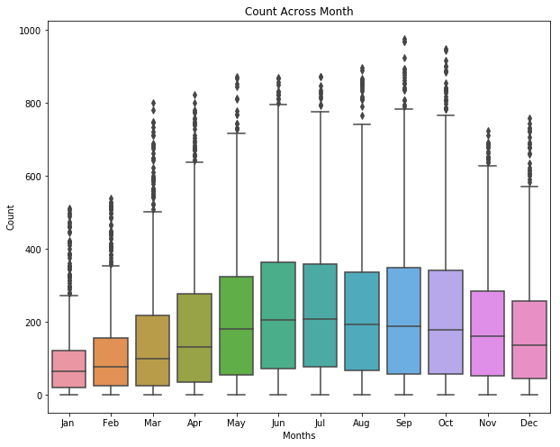
sns.boxplot(data=df, y="count", x="month_str", orient="v")
ax.set(xlabel="Months" , ylabel="Count", title="Count Across Month");
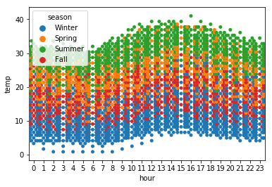
sns.swarmplot(x='hour', y='temp', data=df, hue='season')
plt.show()
# ---------------------------------------------------------
plt.figure(figsize=(6,3))
plt.stackplot(range(1,13),
df.groupby(['month'])['casual_percentage'].mean(),
df.groupby(['month'])['registered_percentage'].mean(),
labels=['Casual','Registered'])
plt.legend(loc='upper left')
plt.margins(0,0)
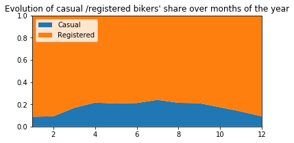
plt.title("Evolution of casual /registered bikers' share over months of the year")
# ---------------------------------------------------------
plt.figure(figsize=(6,6))
df_hours = pd.DataFrame(
{"casual" : df.groupby(['month'])['casual'].mean().values,
"registered" : df.groupby(['month'])['registered'].mean().values},
index = df.groupby(['month'])['casual'].mean().index)
df_hours.plot.bar(rot=0)
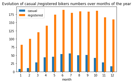
plt.title("Evolution of casual /registered bikers numbers over months of the year")
# ---------------------------------------------------------
plt.show()
<Figure size 432x432 with 0 Axes>
plt.figure(figsize=(10, 5))
bars = ['casual not on working days', 'casual on working days',\
'registered not on working days', 'registered on working days',\
'casual not on holidays', 'casual on holidays',\
'registered not on holidays', 'registered on holidays']
qty = [df.groupby(['workingday'])['casual'].mean()[0], df.groupby(['workingday'])['casual'].mean()[1],\
df.groupby(['workingday'])['registered'].mean()[0], df.groupby(['workingday'])['registered'].mean()[1],\
df.groupby(['holiday'])['casual'].mean()[0], df.groupby(['holiday'])['casual'].mean()[1],\
df.groupby(['holiday'])['registered'].mean()[0], df.groupby(['holiday'])['registered'].mean()[1]]
y_pos = np.arange(len(bars))
plt.barh(y_pos, qty, align='center')
plt.yticks(y_pos, labels=bars)
#plt.invert_yaxis() # labels read top-to-bottom
plt.xlabel('Mean nb of bikers')
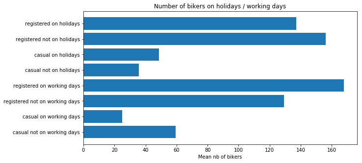
plt.title("Number of bikers on holidays / working days")
plt.show()
# ---------------------------------------------------------
plt.figure(figsize=(6,3))
plt.stackplot(range(1,5),
df.groupby(['season'])['casual_percentage'].mean(),
df.groupby(['season'])['registered_percentage'].mean(),
labels=['Casual','Registered'])
plt.legend(loc='upper left')
plt.margins(0,0)
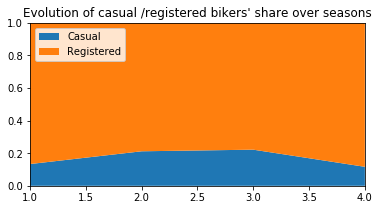
plt.title("Evolution of casual /registered bikers' share over seasons")
# ---------------------------------------------------------
plt.figure(figsize=(6,6))
df_hours = pd.DataFrame(
{"casual" : df.groupby(['season'])['casual'].mean().values,
"registered" : df.groupby(['season'])['registered'].mean().values},
index = df.groupby(['season'])['casual'].mean().index)
df_hours.plot.bar(rot=0)
plt.title("Evolution of casual /registered bikers numbers over seasons")
# ---------------------------------------------------------
plt.show()
<Figure size 432x432 with 0 Axes>
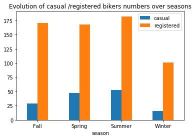
Generally speaking, the number of registered user increase between non working and working days where as the opposite can be seen when it comes to casual users (their number decrease between non working to working days). The spikes on the previous plots may corroborate this assumption because the registered users tend to use bike to go to work while casul users rent bike in the middle of the day…
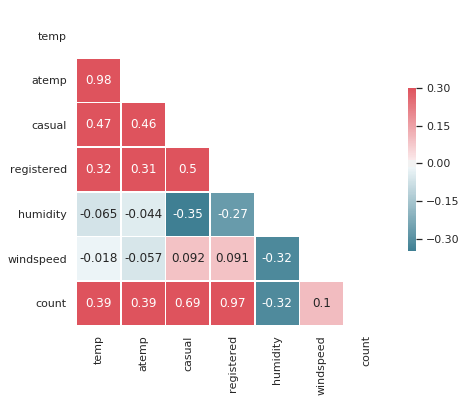
Correlations
sns.set(style="white")

# Compute the correlation matrix
corr = df[["temp","atemp","casual","registered","humidity","windspeed","count"]].corr()

# Generate a mask for the upper triangle
mask = np.zeros_like(corr, dtype=np.bool)
mask[np.triu_indices_from(mask)] = True

# Set up the matplotlib figure
f, ax = plt.subplots(figsize=(7, 6))

# Generate a custom diverging colormap
cmap = sns.diverging_palette(220, 10, as_cmap=True)

# Draw the heatmap with the mask and correct aspect ratio
sns.heatmap(corr, mask=mask, cmap=cmap, vmax=.3, center=0, annot=True,
            square=True, linewidths=.5, cbar_kws={"shrink": .5})
<matplotlib.axes._subplots.AxesSubplot at 0x7fa544b6bbe0>
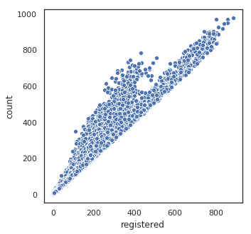
plt.figure(figsize=(5, 5))
sns.scatterplot(df.registered, df['count'])
plt.show()
Data preparation for models
# target
y = (df["count"])

# drop irrelevant cols and target
cols_dropped = ["count", "datetime", "atemp", "month_str", "season", "dow_str", "weather_str",\
                "casual", "registered", "casual_percentage", "registered_percentage", "y_log", "Delta"]
X = df.drop(columns=cols_dropped)

X.shape, y.shape
((10886, 11), (10886,))
y.head()
0    16
1    40
2    32
3    13
4     1
Name: count, dtype: int64
X.head()
| holiday | workingday | weather | temp | humidity | windspeed | dow | month | week | hour | year | |
|---|---|---|---|---|---|---|---|---|---|---|---|
| 0 | 0 | 0 | 1 | 9.84 | 81 | 0.0 | 5 | 1 | 52 | 0 | 2011 |
| 1 | 0 | 0 | 1 | 9.02 | 80 | 0.0 | 5 | 1 | 52 | 1 | 2011 |
| 2 | 0 | 0 | 1 | 9.02 | 80 | 0.0 | 5 | 1 | 52 | 2 | 2011 |
| 3 | 0 | 0 | 1 | 9.84 | 75 | 0.0 | 5 | 1 | 52 | 3 | 2011 |
| 4 | 0 | 0 | 1 | 9.84 | 75 | 0.0 | 5 | 1 | 52 | 4 | 2011 |
Split the data set into a training part and one for testing purpose.
X_train, X_test, y_train, y_test = train_test_split(X, y, test_size=0.2)
Features importance
def get_rmse(reg, model_name):
    """Print the score for the model passed in argument and retrun scores for the train/test sets"""

    y_train_pred, y_pred = reg.predict(X_train), reg.predict(X_test)
    rmse_train, rmse_test = np.sqrt(mean_squared_error(y_train, y_train_pred)), np.sqrt(mean_squared_error(y_test, y_pred))
    print(model_name, f'\t - RMSE on Training  = {rmse_train:.2f} / RMSE on Test = {rmse_test:.2f}')

    return rmse_train, rmse_test
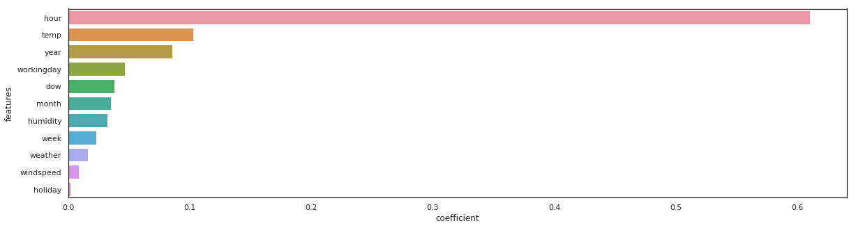
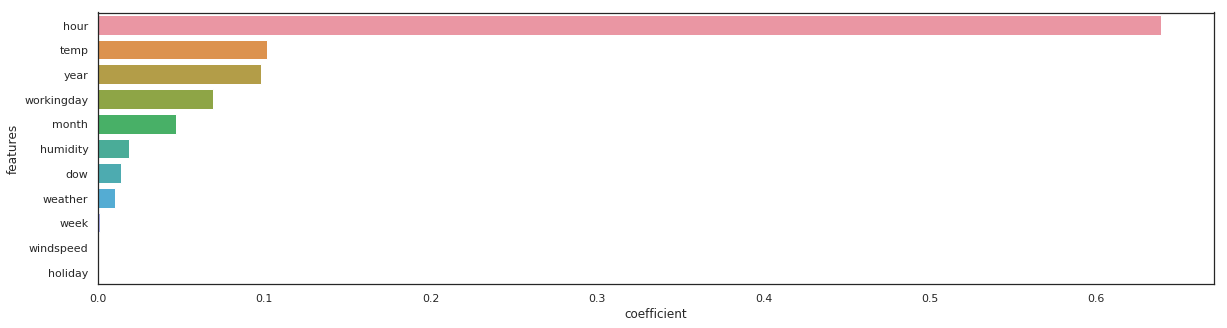
rf = RandomForestRegressor(n_estimators=100).fit(X_train, y_train)
_, _ = get_rmse(rf, 'rondom forrest')

features = pd.DataFrame()
features["features"] = X_train.columns
features["coefficient"] = rf.feature_importances_

features.sort_values(by=["coefficient"], ascending=False, inplace=True)
fig,ax= plt.subplots()
fig.set_size_inches(20,5)
sns.barplot(data=features, x="coefficient", y="features");
rondom forrest - RMSE on Training = 14.94 / RMSE on Test = 42.95
gb = GradientBoostingRegressor(n_estimators=100).fit(X_train, y_train)
_, _ = get_rmse(gb, 'gb')

features = pd.DataFrame()
features["features"] = X_train.columns
features["coefficient"] = gb.feature_importances_

features.sort_values(by=["coefficient"], ascending=False, inplace=True)
fig,ax= plt.subplots()
fig.set_size_inches(20,5)
sns.barplot(data=features, x="coefficient", y="features");
gb - RMSE on Training = 68.02 / RMSE on Test = 72.10
xgb_reg = xgb.XGBRegressor(n_estimators=100).fit(X_train, y_train)
_, _ = get_rmse(xgb_reg, 'xgb_reg')

features = pd.DataFrame()
features["features"] = X_train.columns
features["coefficient"] = xgb_reg.feature_importances_

features.sort_values(by=["coefficient"], ascending=False, inplace=True)
fig,ax= plt.subplots()
fig.set_size_inches(20,5)
sns.barplot(data=features, x="coefficient", y="features");
xgb_reg - RMSE on Training = 68.91 / RMSE on Test = 72.77
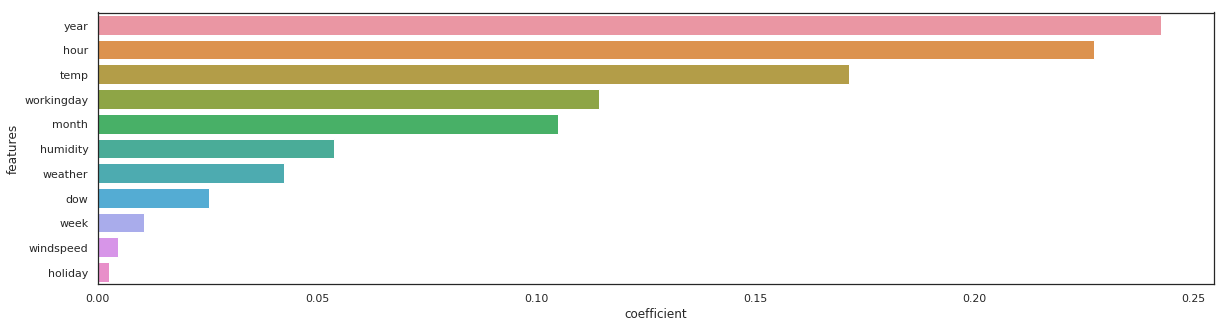
lgbm_reg = lgbm.LGBMRegressor(n_estimators=100).fit(X_train, y_train)
_, _ = get_rmse(lgbm_reg, 'lgbm_reg')

features = pd.DataFrame()
features["features"] = X_train.columns
features["coefficient"] = lgbm_reg.feature_importances_

features.sort_values(by=["coefficient"], ascending=False, inplace=True)
fig,ax= plt.subplots()
fig.set_size_inches(20,5)
sns.barplot(data=features, x="coefficient", y="features");
lgbm_reg - RMSE on Training = 31.57 / RMSE on Test = 40.24
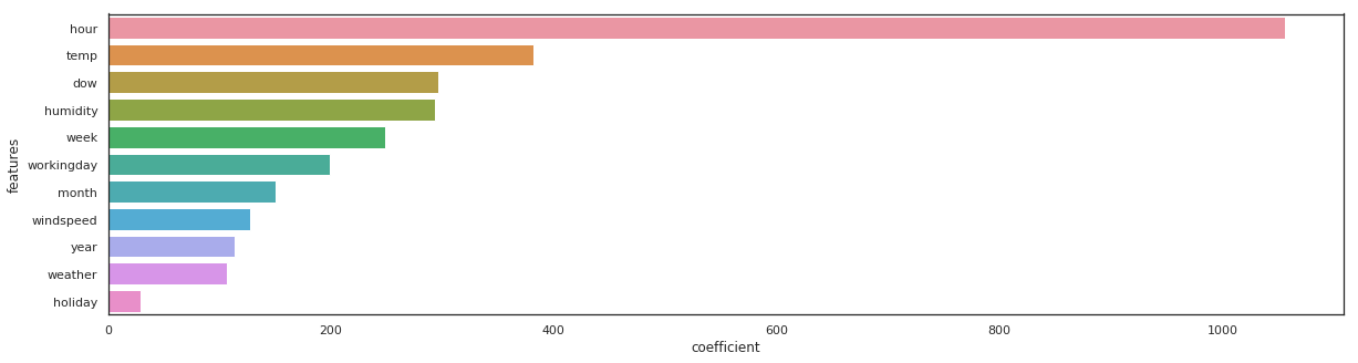
The same feature come first, sometimes the order vary a little bit…
Models training and predictions
Metric - Root Mean Squared Error
Using logarithmic is an indirect way of measuring the performance of a loss function in terms of something more easily understandable
def rmsle(y, y_,convertExp=True):
    if convertExp:
        y = np.exp(y),
        y_ = np.exp(y_)
    log1 = np.nan_to_num(np.array([np.log(v + 1) for v in y]))
    log2 = np.nan_to_num(np.array([np.log(v + 1) for v in y_]))
    calc = (log1 - log2) ** 2
    return np.sqrt(np.mean(calc))
Please, also refer to the get_rmse function coded previously.
Base line & basic models
# list of all the basic models used at first
model_list = [
    LinearRegression(), Lasso(), Ridge(), ElasticNet(),
    RandomForestRegressor(), GradientBoostingRegressor(), ExtraTreesRegressor(),
    xgb.XGBRegressor(), lgbm.LGBMRegressor()
             ]

# creation of list of names and scores for the train / test
model_names = [str(m)[:str(m).index('(')] for m in model_list]
rmse_train, rmse_test = [], []

# fit and predict all models
for model, name in zip(model_list, model_names):
    model.fit(X_train, y_train)
    sc_train, sc_test = get_rmse(model, name)
    rmse_train.append(sc_train)
    rmse_test.append(sc_test)
LinearRegression 	 - RMSE on Training  = 140.53 / RMSE on Test = 146.52
Lasso 	 - RMSE on Training  = 140.57 / RMSE on Test = 146.59
Ridge 	 - RMSE on Training  = 140.53 / RMSE on Test = 146.52
ElasticNet 	 - RMSE on Training  = 143.30 / RMSE on Test = 149.20
RandomForestRegressor 	 - RMSE on Training  = 18.81 / RMSE on Test = 45.08
GradientBoostingRegressor 	 - RMSE on Training  = 68.02 / RMSE on Test = 72.10
ExtraTreesRegressor 	 - RMSE on Training  = 0.00 / RMSE on Test = 44.67
XGBRegressor 	 - RMSE on Training  = 68.91 / RMSE on Test = 72.77
LGBMRegressor 	 - RMSE on Training  = 31.57 / RMSE on Test = 40.24
Polynomial regression
from sklearn.preprocessing import PolynomialFeatures

poly_lin_reg = Pipeline([
    ("poly_feat", PolynomialFeatures(degree=3)),
    ("scaler", StandardScaler()),
    ("linear_reg", LinearRegression())
])

poly_lin_reg.fit(X_train, y_train)

sc_train, sc_test = get_rmse(poly_lin_reg, "Poly Linear Reg")

model_names.append('Poly Linear Reg')
rmse_train.append(sc_train)
rmse_test.append(sc_test)
Poly Linear Reg - RMSE on Training = 107.29 / RMSE on Test = 111.72
Hyperparameters tuning
Lasso
rd_cv = Ridge()
rd_params_ = {'max_iter':[1000, 2000, 3000],
                 'alpha':[0.1, 1, 2, 3, 4, 10, 30, 100, 200, 300, 400, 800, 900, 1000]}

rmsle_scorer = metrics.make_scorer(rmsle, greater_is_better=False)
rd_cv = GridSearchCV(rd_cv,
                  rd_params_,
                  scoring = rmsle_scorer,
                  cv=5)

rd_cv.fit(X_train, y_train)
GridSearchCV(cv=5, error_score='raise-deprecating',
       estimator=Ridge(alpha=1.0, copy_X=True, fit_intercept=True, max_iter=None,
   normalize=False, random_state=None, solver='auto', tol=0.001),
       fit_params=None, iid='warn', n_jobs=None,
       param_grid={'max_iter': [1000, 2000, 3000], 'alpha': [0.1, 1, 2, 3, 4, 10, 30, 100, 200, 300, 400, 800, 900, 1000]},
       pre_dispatch='2*n_jobs', refit=True, return_train_score='warn',
       scoring=make_scorer(rmsle, greater_is_better=False), verbose=0)
Lasso
sc_train, sc_test = get_rmse(rd_cv, "Ridge CV")

model_names.append('Ridge CV')
rmse_train.append(sc_train)
rmse_test.append(sc_test)
Ridge CV - RMSE on Training = 140.53 / RMSE on Test = 146.52
la_cv = Lasso()

alpha  = 1/np.array([0.1, 1, 2, 3, 4, 10, 30, 100, 200, 300, 400, 800, 900, 1000])
la_params = {'max_iter':[1000, 2000, 3000],'alpha':alpha}

la_cv = GridSearchCV(la_cv, la_params, scoring = rmsle_scorer, cv=5)
la_cv.fit(X_train, y_train).best_params_
{'alpha': 10.0, 'max_iter': 1000}
sc_train, sc_test = get_rmse(la_cv, "Lasso CV")

model_names.append('Lasso CV')
rmse_train.append(sc_train)
rmse_test.append(sc_test)
Lasso CV - RMSE on Training = 142.24 / RMSE on Test = 148.05
Knn regressor
knn_reg = KNeighborsRegressor()
knn_params = {'n_neighbors':[1, 2, 3, 4, 5, 6]}

knn_reg = GridSearchCV(knn_reg, knn_params, scoring = rmsle_scorer, cv=5)
knn_reg.fit(X_train, y_train).best_params_
{'n_neighbors': 1}
sc_train, sc_test = get_rmse(knn_reg, "kNN Reg")

model_names.append('kNN Reg')
rmse_train.append(sc_train)
rmse_test.append(sc_test)
kNN Reg - RMSE on Training = 0.00 / RMSE on Test = 140.08
LinearSVR
svm_reg = Pipeline([
    ("scaler", StandardScaler()),
    ("linear_svr", LinearSVR())
])

svm_reg.fit(X_train, y_train)

sc_train, sc_test = get_rmse(svm_reg, "SVM Reg")

model_names.append('SVM Reg')
rmse_train.append(sc_train)
rmse_test.append(sc_test)
SVM Reg - RMSE on Training = 146.86 / RMSE on Test = 153.43
Just for fun: a MLP (Multi Layer Perceptron)
I don’t expect this model to be reall efficient because it’s probably far too complex for our needs… but that’s just for fun!
scaler = StandardScaler()
X_scaled = scaler.fit_transform(X)

X_train_, X_test_, y_train, y_test = train_test_split(X_scaled, y, test_size=0.2, random_state=0)
import tensorflow as tf
def model_five_layers(input_dim):

    model = tf.keras.models.Sequential()

    # Add the first Dense layers of 100 units with the input dimension
    model.add(tf.keras.layers.Dense(100, input_dim=input_dim, activation='sigmoid'))

    # Add four more layers of decreasing units
    model.add(tf.keras.layers.Dense(100, activation='sigmoid'))
    model.add(tf.keras.layers.Dense(100, activation='sigmoid'))
    model.add(tf.keras.layers.Dense(100, activation='sigmoid'))
    model.add(tf.keras.layers.Dense(100, activation='sigmoid'))

    # Add finally the output layer with one unit: the predicted result
    model.add(tf.keras.layers.Dense(1, activation='relu'))

    return model
model = model_five_layers(input_dim=X_train.shape[1])

# Compile the model with mean squared error (for regression)
model.compile(optimizer='SGD', loss='mean_squared_error')

# Now fit the model on XXX epoches with a batch size of XXX
# You can add the test/validation set into the fit: it will give insights on this dataset too
model.fit(X_train_, y_train, validation_data=(X_test_, y_test), epochs=200, batch_size=8)
WARNING:tensorflow:From /home/sunflowa/Anaconda/lib/python3.7/site-packages/tensorflow/python/ops/resource_variable_ops.py:435: colocate_with (from tensorflow.python.framework.ops) is deprecated and will be removed in a future version.
Instructions for updating:
Colocations handled automatically by placer.
WARNING:tensorflow:From /home/sunflowa/Anaconda/lib/python3.7/site-packages/tensorflow/python/keras/utils/losses_utils.py:170: to_float (from tensorflow.python.ops.math_ops) is deprecated and will be removed in a future version.
Instructions for updating:
Use tf.cast instead.
Train on 8708 samples, validate on 2178 samples
WARNING:tensorflow:From /home/sunflowa/Anaconda/lib/python3.7/site-packages/tensorflow/python/ops/math_ops.py:3066: to_int32 (from tensorflow.python.ops.math_ops) is deprecated and will be removed in a future version.
Instructions for updating:
Use tf.cast instead.
Epoch 1/200
8708/8708 [==============================] - 1s 127us/sample - loss: 38212.8034 - val_loss: 37116.1185
Epoch 2/200
8708/8708 [==============================] - 1s 101us/sample - loss: 36155.7200 - val_loss: 30416.4880
Epoch 3/200
8708/8708 [==============================] - 1s 102us/sample - loss: 34061.7786 - val_loss: 33251.2080
Epoch 4/200
8708/8708 [==============================] - 1s 104us/sample - loss: 34448.0311 - val_loss: 33964.8975
Epoch 5/200
8708/8708 [==============================] - 1s 102us/sample - loss: 34450.1169 - val_loss: 35355.5311
7us/sample - loss: 35475.3280 - val_loss: 38654.4456

...

Epoch 195/200
8708/8708 [==============================] - 1s 95us/sample - loss: 35762.5541 - val_loss: 36520.5384
Epoch 196/200
8708/8708 [==============================] - 1s 97us/sample - loss: 35349.9739 - val_loss: 39536.0127
Epoch 197/200
8708/8708 [==============================] - 1s 95us/sample - loss: 35585.8599 - val_loss: 33362.7076
Epoch 198/200
8708/8708 [==============================] - 1s 95us/sample - loss: 35124.1187 - val_loss: 42101.3971
Epoch 199/200
8708/8708 [==============================] - 1s 96us/sample - loss: 35766.2078 - val_loss: 34425.0247
Epoch 200/200
8708/8708 [==============================] - 1s 93us/sample - loss: 35553.1240 - val_loss: 35824.4136


<tensorflow.python.keras.callbacks.History at 0x7fa53c534860>
y_train_pred, y_pred = model.predict(X_train_), model.predict(X_test_)
rmse_train_, rmse_test_ = np.sqrt(mean_squared_error(y_train, y_train_pred)), np.sqrt(mean_squared_error(y_test, y_pred))
print("MLP reg", f'\t - RMSE on Training  = {rmse_train_:.2f} / RMSE on Test = {rmse_test_:.2f}')

#sc_train, sc_test = get_rmse(model, "MLP reg")

model_names.append('MLP reg')
rmse_train.append(rmse_train_)
rmse_test.append(rmse_test_)
MLP reg - RMSE on Training = 188.90 / RMSE on Test = 189.27
Conclusion and submission
Before making a submission we have to choose the best model i.e with the smallest RMSE.
df_score = pd.DataFrame({'model_names' : model_names,
                         'rmse_train' : rmse_train,
                         'rmse_test' : rmse_test})
df_score = pd.melt(df_score, id_vars=['model_names'], value_vars=['rmse_train', 'rmse_test'])
df_score.head(10)
| model_names | variable | value | |
|---|---|---|---|
| 0 | LinearRegression | rmse_train | 140.527242 |
| 1 | Lasso | rmse_train | 140.566345 |
| 2 | Ridge | rmse_train | 140.527244 |
| 3 | ElasticNet | rmse_train | 143.301234 |
| 4 | RandomForestRegressor | rmse_train | 18.810298 |
| 5 | GradientBoostingRegressor | rmse_train | 68.017857 |
| 6 | ExtraTreesRegressor | rmse_train | 0.001515 |
| 7 | XGBRegressor | rmse_train | 68.907661 |
| 8 | LGBMRegressor | rmse_train | 31.570179 |
| 9 | Poly Linear Reg | rmse_train | 107.292639 |
plt.figure(figsize=(12, 10))
sns.barplot(y="model_names", x="value", hue="variable", data=df_score)
<matplotlib.axes._subplots.AxesSubplot at 0x7fa544c9af98>
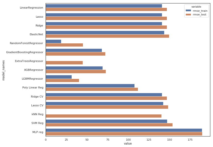
- The MLP model is indeed useless
- All linear regression have the same poor result, regularization using L1 or L2 with Lasso & Ridge doesn’t change anything which is quite obvious because those models are underfiting and need to be complexified (not regularized!). The same argument applies to ElasticNet which is a combinaison of the 2 above.
- Gridsearch don’t change anything because tuning regularization hyperparameters is not interesting for the same reason.
- The polynomial use help to improve results a little bit.
- Gradient Boosting & XGBoost Regressors are performing well without too overfitting.
- ExtraTree Regressor is out
- Random Forrest & LGBM Regressors are the best but the first one is clearly overfitting, so it would be better to choose the second one : LGBM Regressor
Now let’s see how do we have to sumbit our answer
y_sample = pd.read_csv("../input/sampleSubmission.csv")
y_sample.head()
| datetime | count | |
|---|---|---|
| 0 | 2011-01-20 00:00:00 | 0 |
| 1 | 2011-01-20 01:00:00 | 0 |
| 2 | 2011-01-20 02:00:00 | 0 |
| 3 | 2011-01-20 03:00:00 | 0 |
| 4 | 2011-01-20 04:00:00 | 0 |
df_test = pd.read_csv("../input/test.csv")
df_test = change_datetime(df_test)

# keep this col for the submission
datetimecol = df_test["datetime"]

test_cols_dropped = ['datetime',
 'atemp',
 'month_str',
 'season',
 'dow_str',
 'weather_str']

df_test = df_test.drop(columns=test_cols_dropped)
df_test.head()
| holiday | workingday | weather | temp | humidity | windspeed | dow | month | week | hour | year | |
|---|---|---|---|---|---|---|---|---|---|---|---|
| 0 | 0 | 1 | 1 | 10.66 | 56 | 26.0027 | 3 | 1 | 3 | 0 | 2011 |
| 1 | 0 | 1 | 1 | 10.66 | 56 | 0.0000 | 3 | 1 | 3 | 1 | 2011 |
| 2 | 0 | 1 | 1 | 10.66 | 56 | 0.0000 | 3 | 1 | 3 | 2 | 2011 |
| 3 | 0 | 1 | 1 | 10.66 | 56 | 11.0014 | 3 | 1 | 3 | 3 | 2011 |
| 4 | 0 | 1 | 1 | 10.66 | 56 | 11.0014 | 3 | 1 | 3 | 4 | 2011 |
We train our model on the whole data set (not only the splitted part). The more data we use, the better would be the results.
lgbm_reg = lgbm.LGBMRegressor()
lgbm_reg.fit(X, y)
y_pred_final = lgbm_reg.predict(df_test)
submission = pd.DataFrame({
        "datetime": datetimecol,
        "count": [max(0, x) for x in y_pred_final]
    })
submission.to_csv('bike_prediction_output.csv', index=False)

submission.head()
| datetime | count | |
|---|---|---|
| 0 | 2011-01-20 00:00:00 | 12.423966 |
| 1 | 2011-01-20 01:00:00 | 6.649667 |
| 2 | 2011-01-20 02:00:00 | 3.565470 |
| 3 | 2011-01-20 03:00:00 | 0.704959 |
| 4 | 2011-01-20 04:00:00 | 0.704959 |
Submit to kaggle, this model scores 0.41233. Not bad :)
